Theme
Shows the distribution of features by a theme attribute, as a pie chart.
In this post, we will explore the Theme Chart, a powerful visual tool that allows you to visualize the distribution of features based on a specified theme attribute in a pie chart format.
Why using a Theme chart?
The Theme chart simplifies data exploration and aids in analyzing feature distributions by using customized colors. It is possible to match your map view styling with a theme chart.
Another advantage of using a theme chart is, that you can create multiple charts in one widget, which are selectable through a dropdown list.
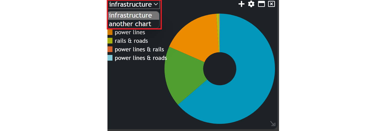
Creating a Theme Chart
To begin, navigate to the widget menu and select Theme from the list of Graph Widgets.
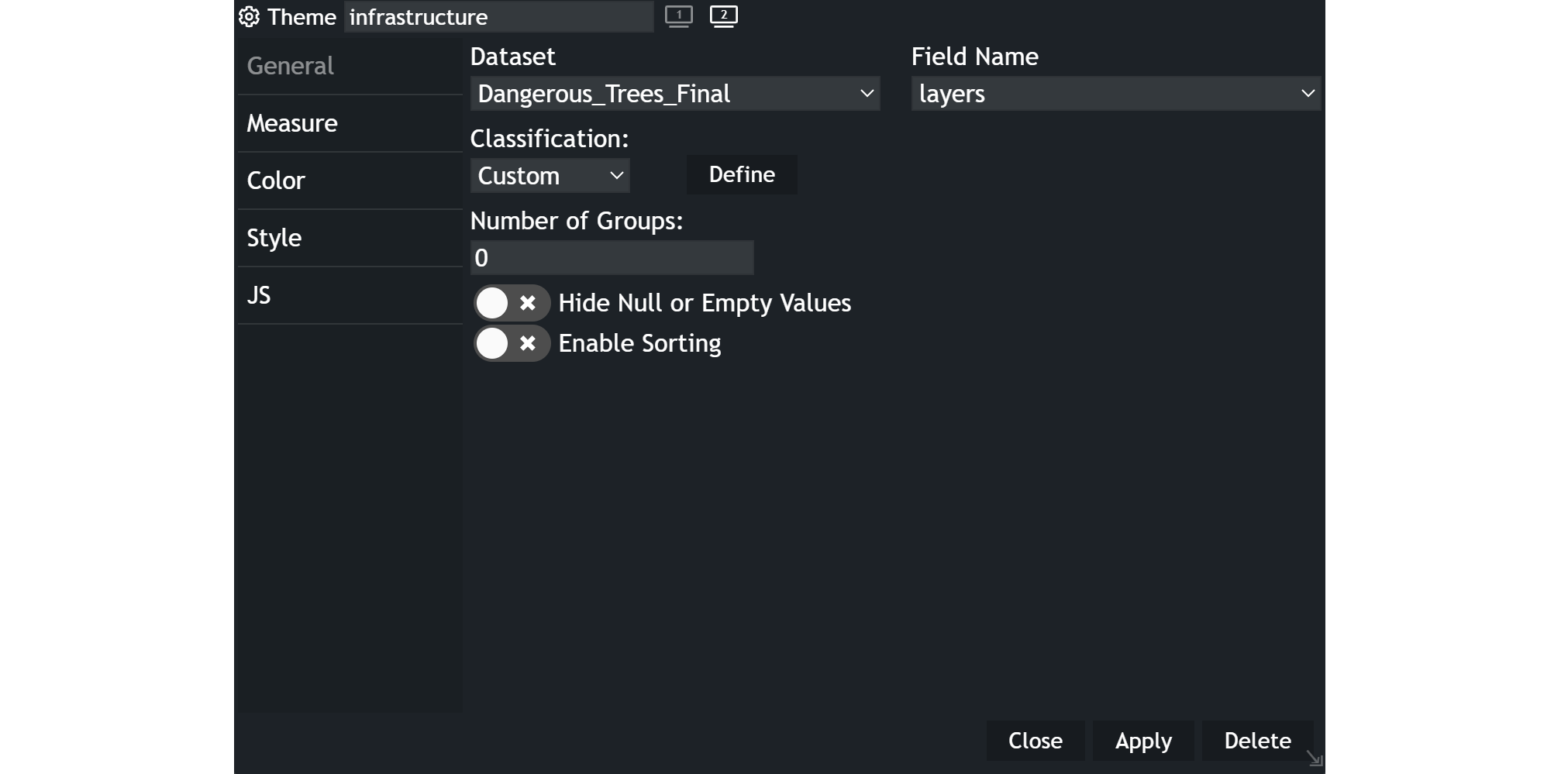
Configuring your chart
Once you're in the theme configuration menu, set up your chart preferences.
- Customize the chart name by clicking on
My New Chartat the top of the modal. - Choose your
datasetand the specificfieldyou want to display. - Select the
classificationcriteria that best suits your needs. - Select the number of
groupsyou wish to include in the chart. - Decide whether you want to
hide null or empty values. - Decide whether you want to
enable sortingor not.
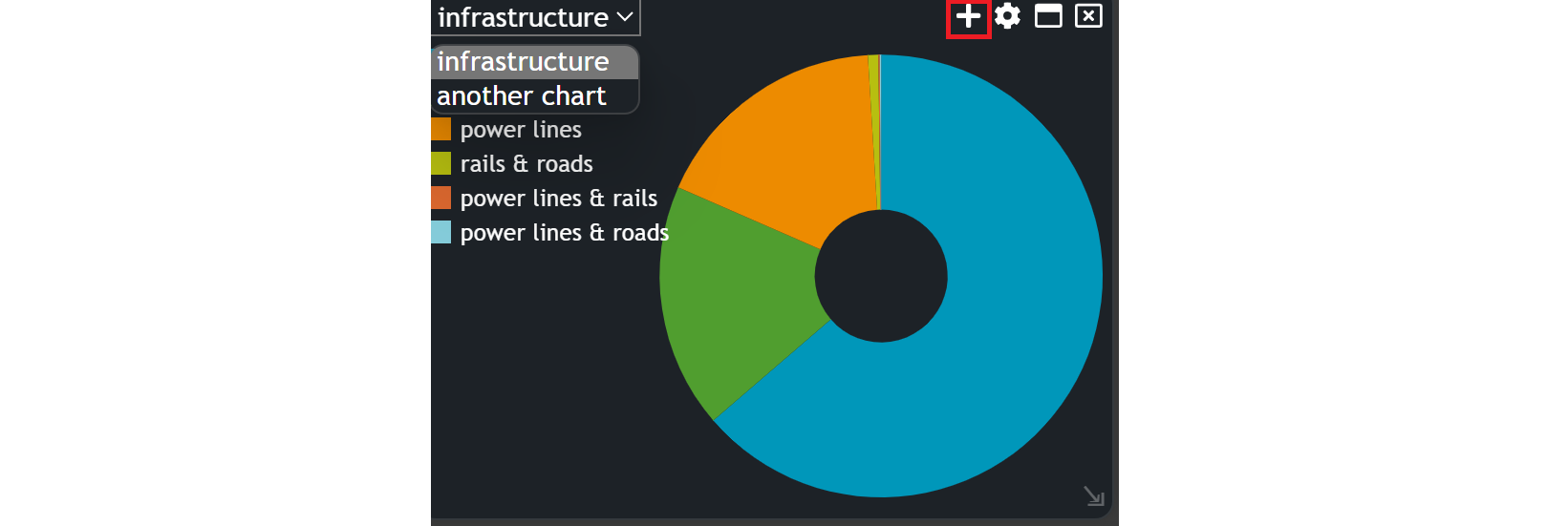
When your widget is created, you can add a second chart within your theme widget. Just click on the plus icon and configure your chart again.
Example
~Map view in combination with a theme chart~
Updated on Aug 11, 2026