Temporal Heatmap
Shows the count of features across days and hours as a matrix chart.
In this post, we will explore the Temporal Heatmap chart, a powerful visual tool designed to help you understand the count of features over days and hours using a matrix chart.
The Temporal Heatmap chart simplifies data exploration and provides insights into how feature counts change over time.
Creating the Temporal Heatmap
To begin, navigate to the widget menu and select Temporal Heatmap from the Temporal Widgets.

Configuring your chart
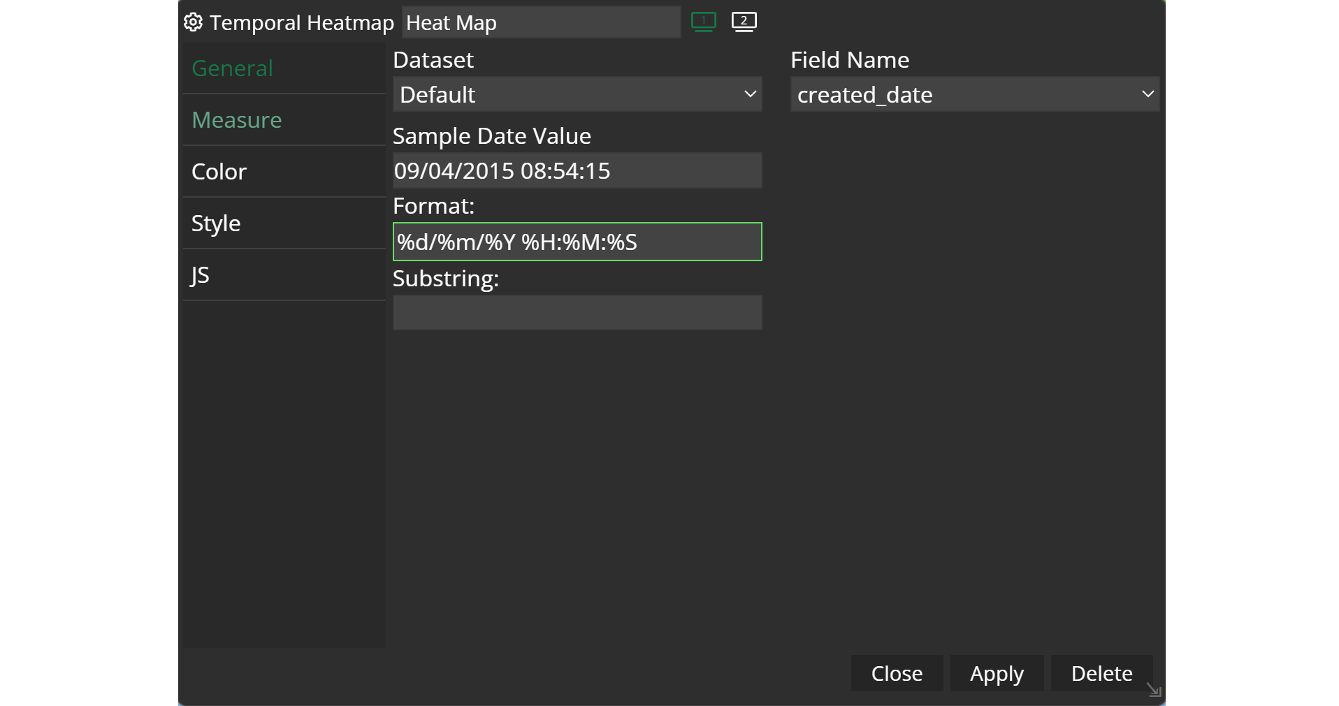
Once you're in the temporal heatmap configuration menu, set up your chart preferences.
- Customize the chart name by clicking on
My New Chartat the top of the modal. - Choose your
datasetand the specificfieldyou want to display. - Select the
formatthat best suits your needs- For Example: %m%d%Y
- Decide the
substringyou need. In case your date attribute comes with a format like this: %d/%m/%Y %H:%M:%S you can decide which part you want to include. For example, 1,8 will take the content from position 1 to position 8.
Example
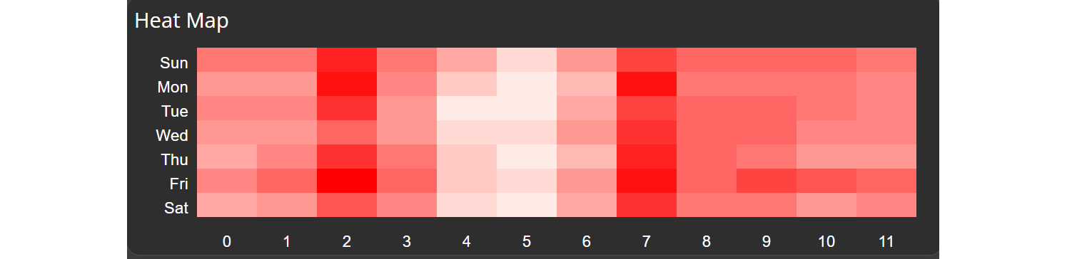
After applying your configuration, you will get a nice temporal heat map like in the example below. You can hover over the fields and get the values for each field.
Updated on Aug 11, 2026