Scatter
Shows the relationship between two attributes of your features as a scatter chart.
In this tutorial, we will delve into the Scatter Chart, a robust visual tool that illustrates the distribution of features by utilizing two attributes in a scatter chart.
💡
A scatterplot shows the relationship of two attributes of a dataset. Depending on the pattern of the dots, a correlation can be derived.
Creating a Scatterplot
Select the Scatter icon from the list of graph widgets in the widget menu.

Configuring your chart
- Name your widget in the
namefield on top of the configuration form next to Scatter.
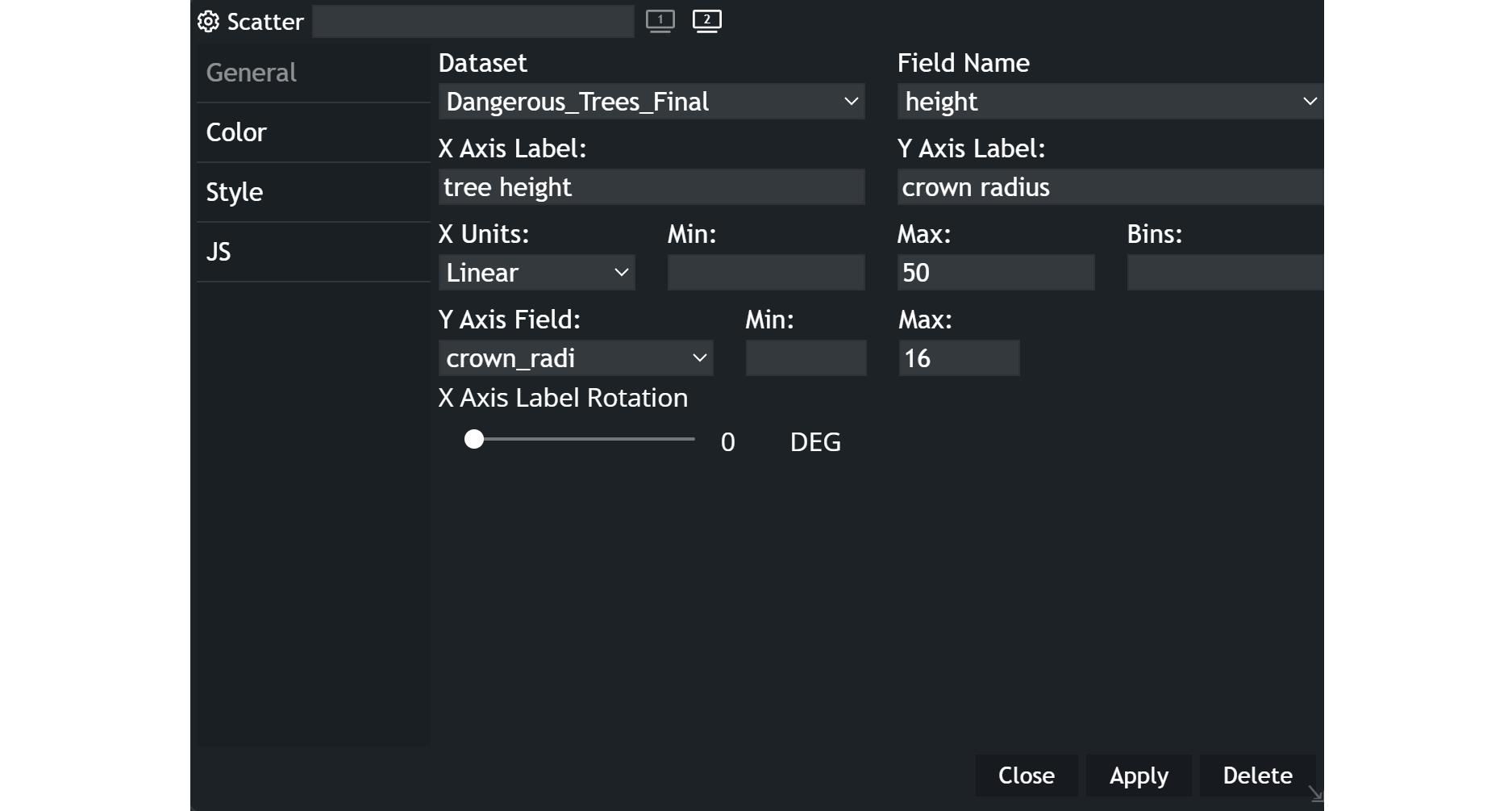
- Choose your
datasetand thefieldname you wish to display. - Specify the
labelsfor the X and Y axes. - Select the most appropriate
unitfrom the dropdown menu for the X-axis. Ordinal setting categorizes the attribute's values, while linear allows for more flexibility. - Choose the
Y-axis fieldthat you want to investigate in combination with the field indicated above. - Set the minimum and maximum values to suit your needs.
- Opt for the
X-axis rotationangle that best suits your requirements.
Example
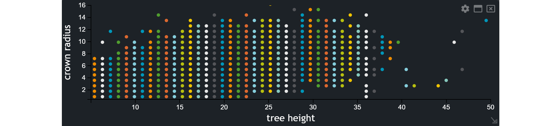
The example illustrates the relationship between two attributes.
Updated on Aug 11, 2026