Gauge
Shows a single calculated value of a dataset, such as an average or a sum.
The Gauge chart enables you to show specific calculated values of your datasets, such as an average or sum. In this tutorial, we will guide you through the process of utilizing the Gauge chart.
Creating a Gauge Chart
To begin, navigate to the widget menu and select Gauge from the list of Display Widgets.

Configuring your chart
Once you're in the gauge configuration menu, set up your chart preferences.
- Customize the chart
nameby clicking onMy New Chartat the top of the modal.
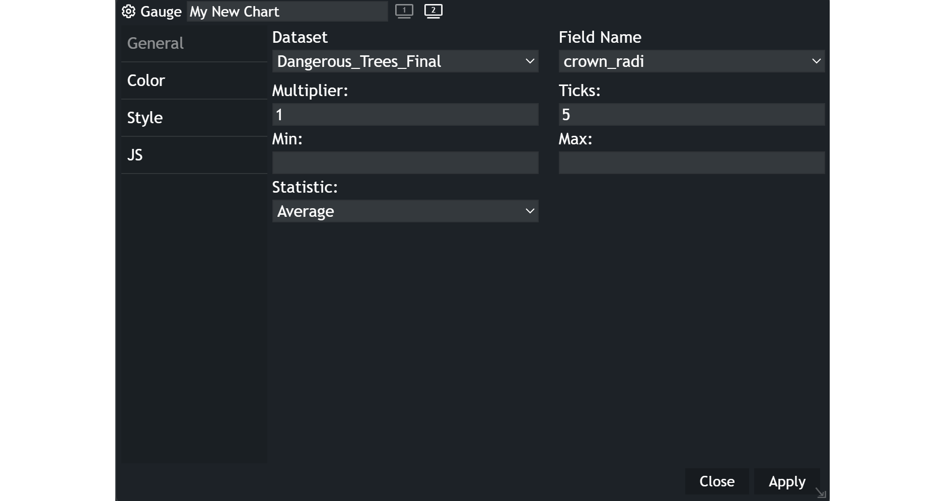
- Choose your
datasetand the specificfieldyou want to display. - Define a
multiplierif necessary. It will multiply all your values by the specified number. - Set the
number of tickson your gauge. The ticks indicate the number of ranges withing the distribution of values. - Establish the
min and max valuesfor your gauge’s scale. You can further limit the range of the displayed gauge with that setting. - Select the
type of statisticto display on the gauge, such as Average, sum or percent of sum.
Examples
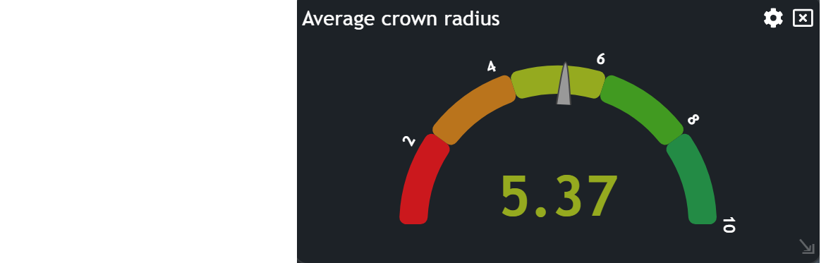
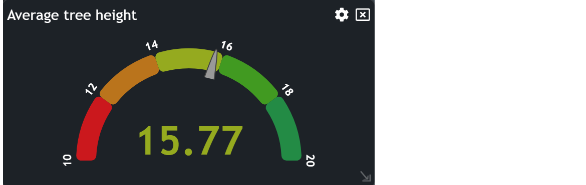
As you can see in the examples, an average value of different attributes is displayed. The gauge supports the visual presentation.
Updated on Aug 11, 2026