Heatmap
Compares two attributes and shows the count, sum or average of the features between them.
In this tutorial, we will explore the Heatmap chart, a powerful visual tool that allows you to understand and analyze data by representing the count/sum or average of features using two attributes.
💡
The Heatmap chart provides a comprehensive view of data trends and relationships by using colors in a matrix of values. The chart combines two attributes from one dataset and is best used with generalized numerical data and categories.
Let's break it down into easy-to-follow steps:
Creating a Heatmap Widget
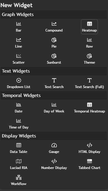
To begin, navigate to theNew Widget menu. Select Heatmap from the list of Graph Widgets.
Configuring your chart
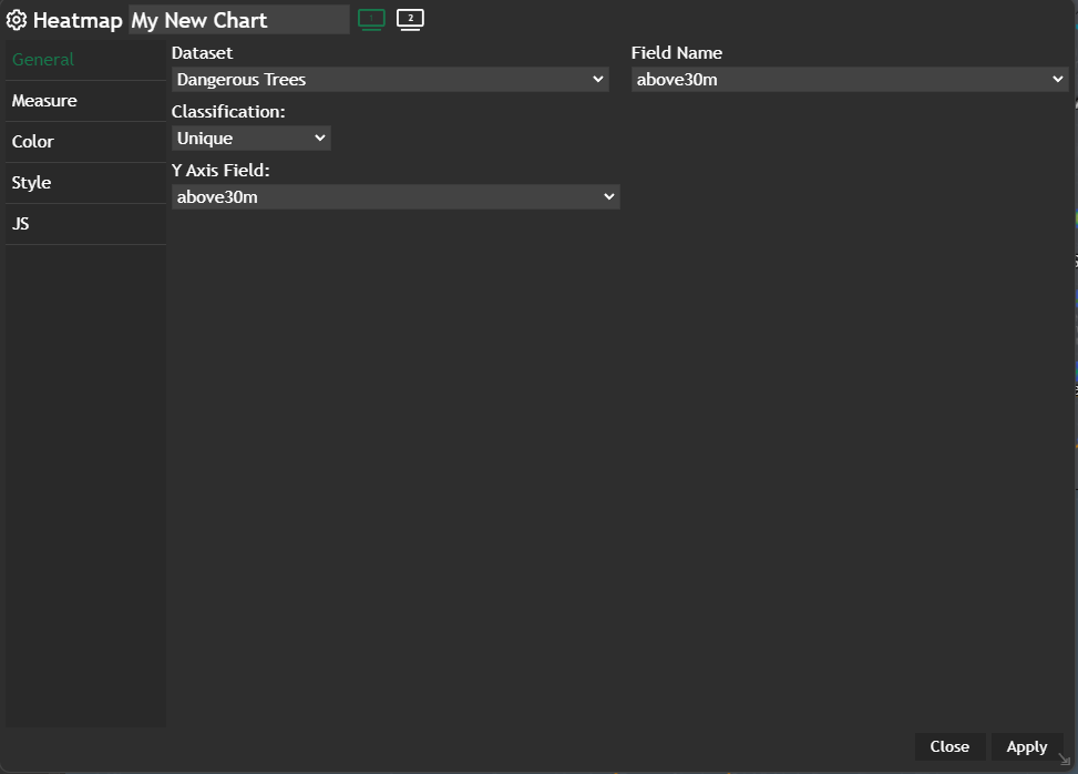
Once you're in the heatmap configuration menu, set up your chart preferences:- Customize the chart name by clicking on
My New Chartat the top of the modal - Choose your
Datasetand the specificField nameyou want to display - Select the
Classificationcriteria that best suits your needs - Select the
Y Axis Fieldthat best suits your needs
Apply and your configured chart will be displayed in a new modal.
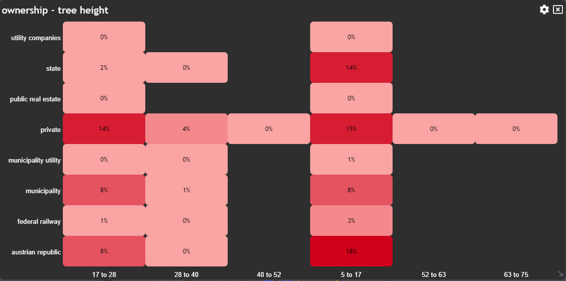
Example
By following these steps, you can use the Heatmap chart to analyze data and gain valuable insights into the relationships and trends between two attributes.
Updated on Aug 11, 2026