Tabbed Chart
Combines several charts behind tabs to keep a crowded dashboard readable.
In this tutorial, we will explore the Tabbed chart, a powerful visual tool that enhances the cleanliness of your dashboard interface, especially when dealing with numerous widgets.
A Tabbed Chart enables you to combine multiple charts of the same type. You can easily switch views between them. Tabbed charts help to make your Dashboard readable and not overloaded with widgets.
Creating a Tabbed Chart
To begin, navigate to the widget menu ans select Tabbed from the list of Temporal Widgets.

Configuring your chart
- Customize the chart name by clicking on
My New Chartat the top of the modal. - Choose the
datasetyou want to base your widget on. - Select the
orientationyou want to display. This basically indicates where the bar with the widgets will be displayed. - Transfer widgets from the available widgets to the selected widgets by dragging and dropping them.
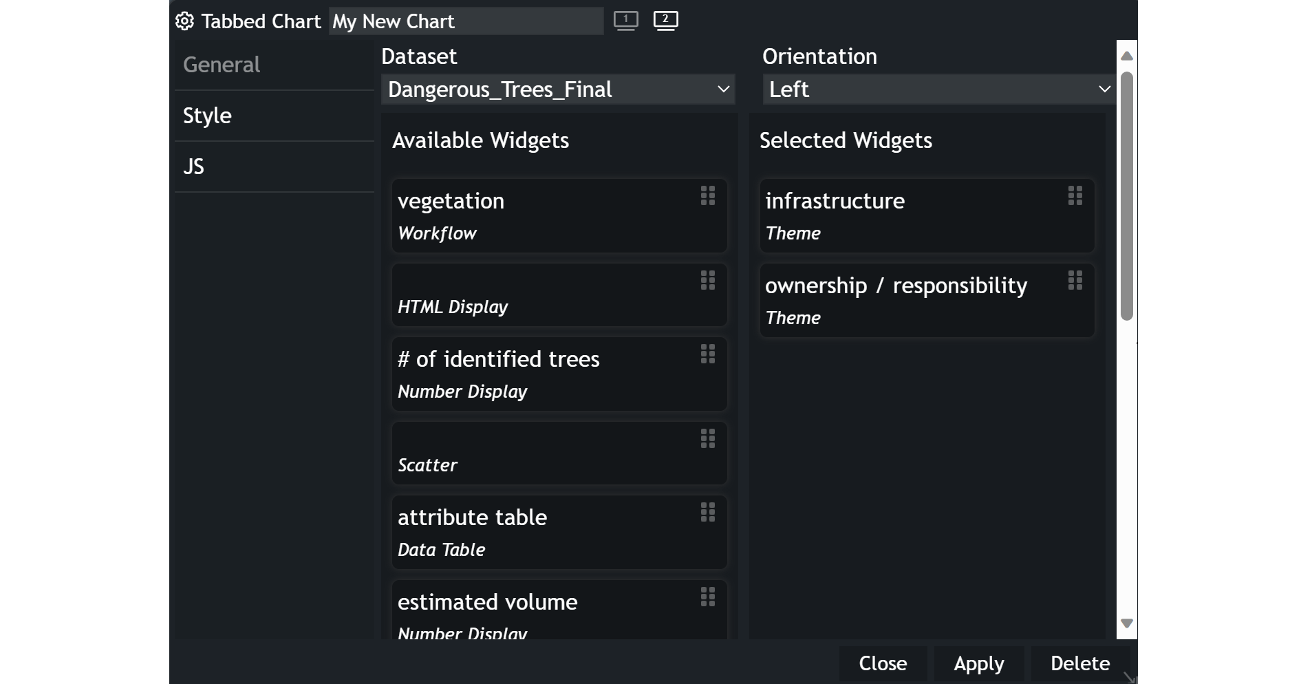
Click the Apply button, and your configured chart will appear in a new modal.
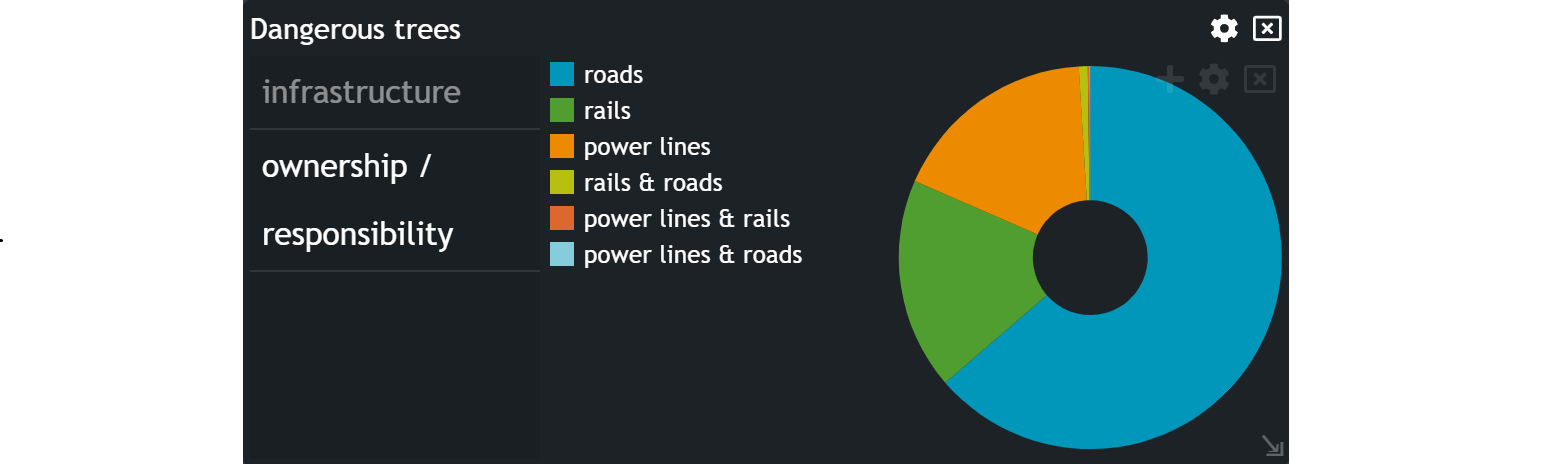
Example
You can switch between the widgets by clicking on the designated widget name. The selected widget's name is indicated by grey color.
Updated on Aug 11, 2026