Row
In this content post, we will explore the Row Chart, a valuable visual tool that allows you to visualize the distribution of features based on a specified attribute.
💡
The Row Chart aids in comprehending feature distributions and simplifies data analysis. It differs from a bar chart only in the visual orientation.
Let's break it down into easy-to-follow steps:
Creating a row widget
To begin, navigate to theNew widget menu.
Select Row from the list of Graph widgets.

Configuring your widget
Once you're in the row configuration menu, set up your chart preferences.- Customize the chart name by clicking on
My New Chartat the top of the modal - Choose your
datasetand the specific field you want to display - Select the
Classificationcriteria that best suits your needs - Select the number of
groupsyou wish - Decide whether you want to
hide null or empty values - Decide whether you want to
enable sortingor not
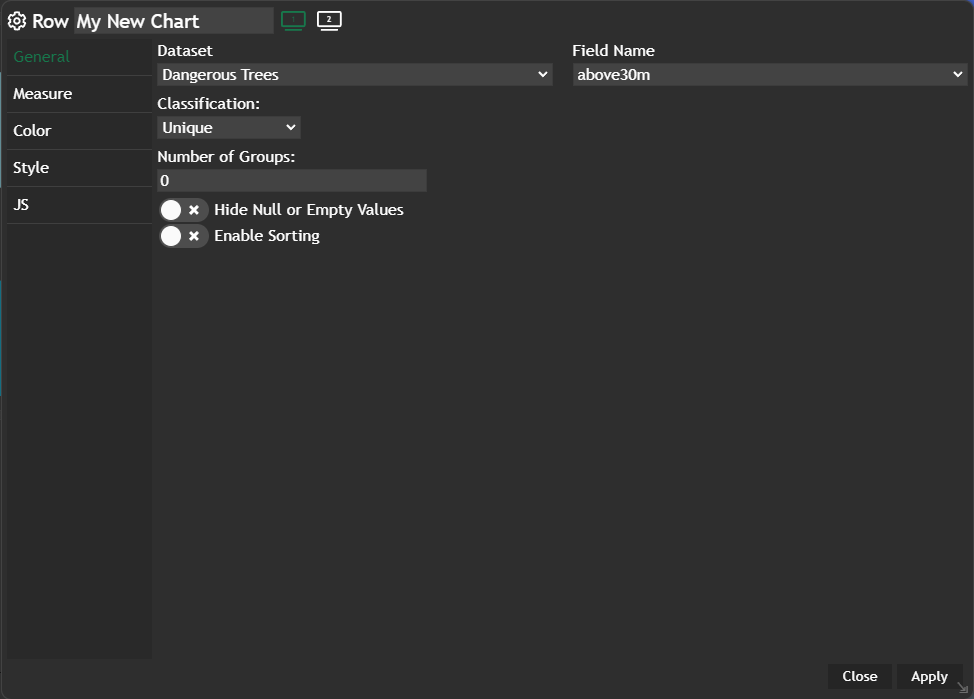
Apply and your configured chart will be displayed in a new widget.
Example
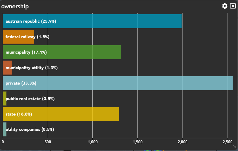
By following these steps, you can use the Row chart to visualize feature distributions and apply filters.