Motifs
Motifs can be understood as design patterns or templates representing a particular aesthetic or style. This post will introduce you to all the available options for a Dashboard.
Customize your design

Within the Dashboard Editor navigate to the color palette icon in the menu bar. Hovering over it, reveals the label My New Chart. Upon clicking you will see the window below.
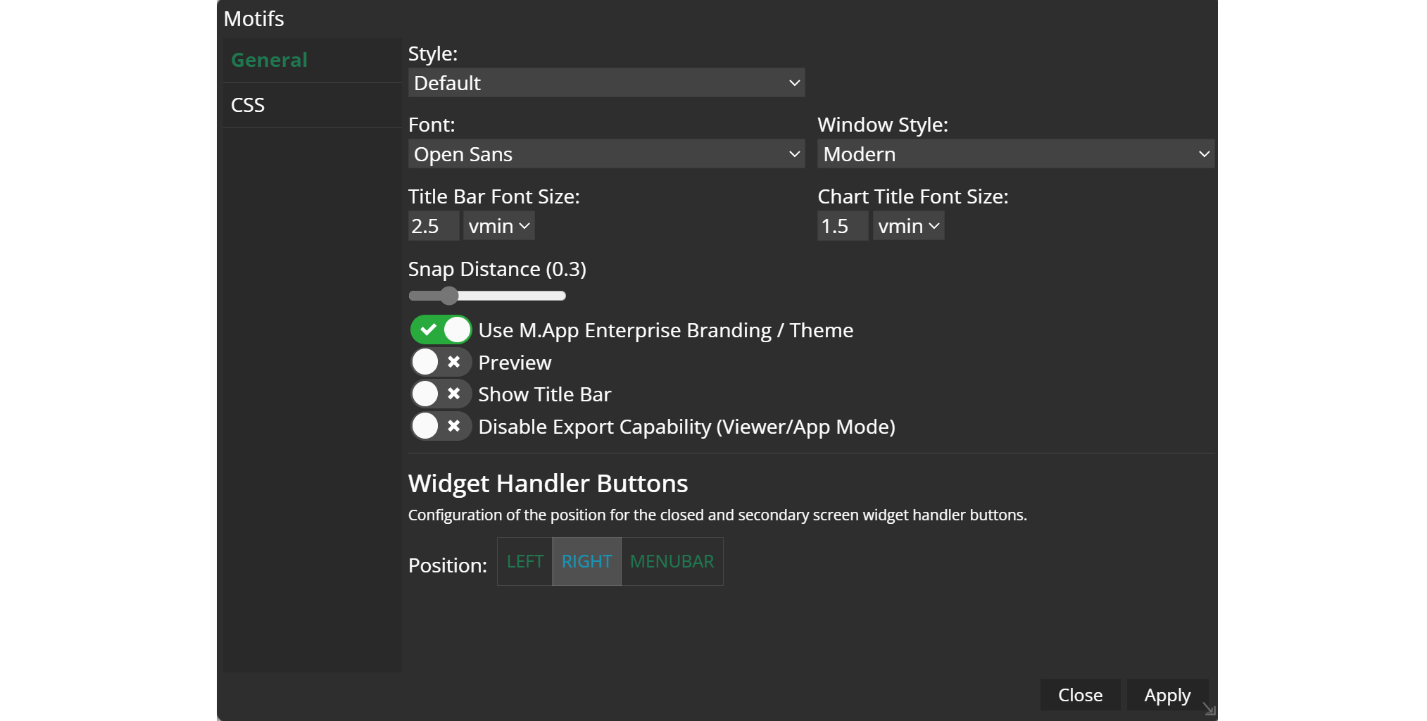
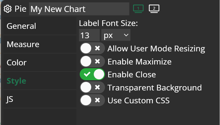
Within the General tab of motifs you will find a number of setting options:
Style: You have the option to select a color that will be applied to all elements in the app, including the menu, widgets, scale, north arrow, and zoom settings.
Font: Change the font family for all written text in widgets etc.
Window Style: You can decide whether your widget windows look more traditional or modern.
Font Size: Both font size for the title bar and chart title can be selected.
Snap Distance: Provides a grid which helps you to place your widget in the App. When the snap distance is higher, the grid is coarser as well.
Use M.App Enterprise Branding/ThemePreviewShow Title BarDisable Export Capability: Disables the export of your motifs' template.
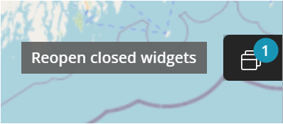
Widget Handler Buttons 
This becomes particularly crucial when you enable the option for your widgets to be closable in their settings. Once a widget is closed, a small button will appear, providing the option to reopen it. Dependent on the Position you can place the button either left or right in the App window, or directly in the menubar.