Luciad RIA
This post relates to the Luciad RIA widget and the possibilities it offers in a Dashboard. Luciad RIA is, in a sense, the heart of a Dashboard as it both visualizes your geodata but also determines over analyzer layers and their settings.
Luciad RIA plays a role in many settings within the overall Dashboard configuration. It contains the map view configuration as well as the analyzer layer selection, next to more detailed feature settings.
Let's have a look at all the areas.
Map View Wizard
The Map view wizard is accessed from the Studio page of M.App Enterprise: Content → Browser → Dashboard
Within the Dashboard list, click on the icon that looks like a pie chart, situated on the right of any existing Dashboard.

By clicking on it, you will be forwarded to the map view wizard, where you need to make some settings before you are able to create numerous widgets.
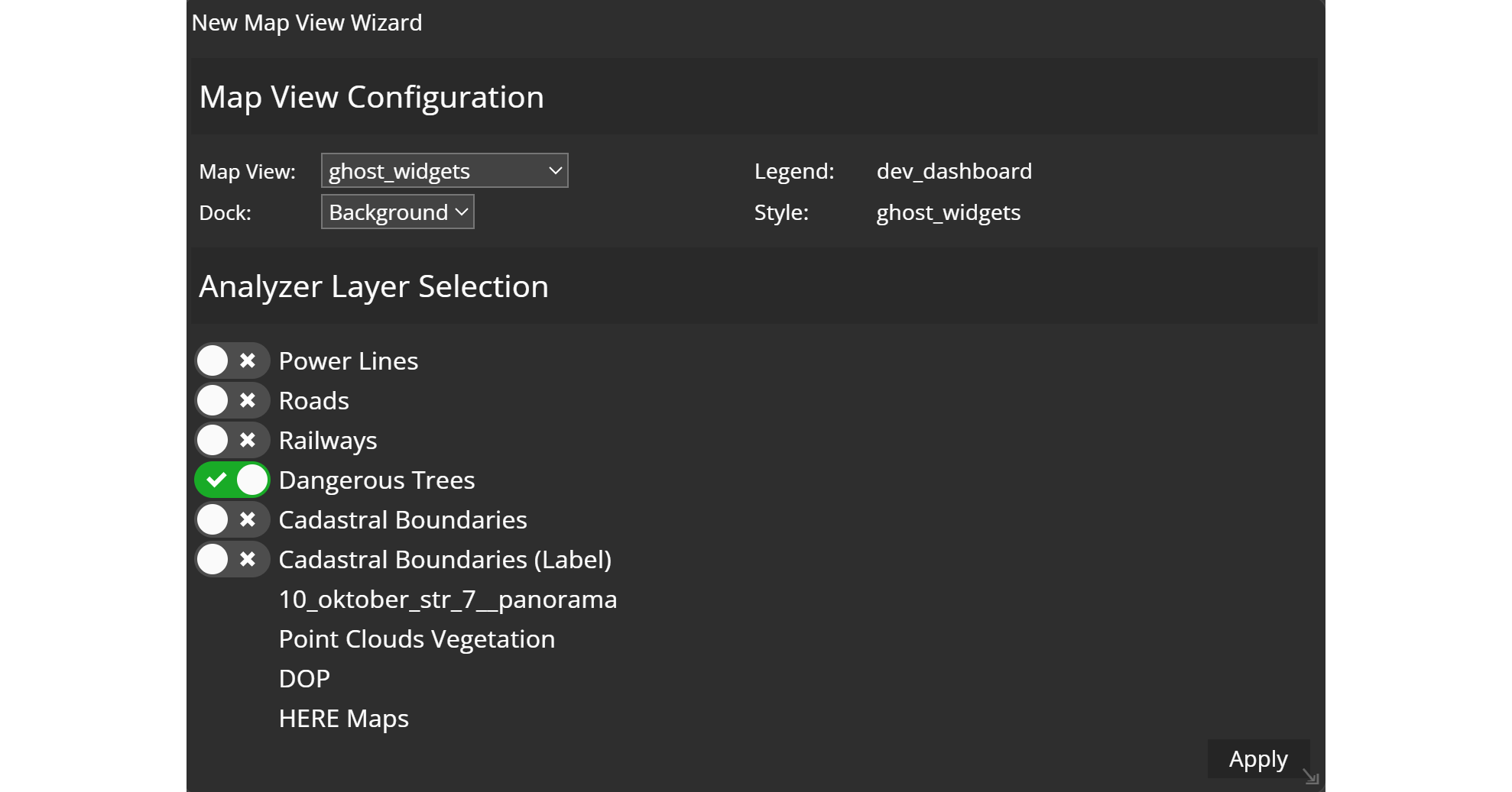
Map View Configuration
Within this section you will have to indicate a map view from the dropdown, and decide how your map will be displayed. There are three options:
- the map can serve as your Dashboard background
- the map can be displayed in smaller window on the Dashboard page
- the map will only be visible when clicking on an icon
The legend and style are automatically adopted with the map view.
Analyzer Layer Selection
In this section you can select layers for the analysis in Dashboard. The list of layers consists of the according legend from your map view. Keep in mind that only the selected layers will be available for your widgets. However, this setting can be changed any time.
Click on apply and have a first draft of your Dashboard.
Luciad RIA widget
Another way to display a map in your Dashboard, is to create a Luciad RIA widget. Just navigate to the new widget menu and select Luciad RIA from the Display widgets.

Once you click on it, you will get to the same configuration window as in the map view wizard mentioned earlier in this post. Make your desired map view settings and choose your analyzer layers.
However, there are more options in Luciad RIA when you move to the Features tab. You can add a Primary, Cluster or Heatmap to your map view.
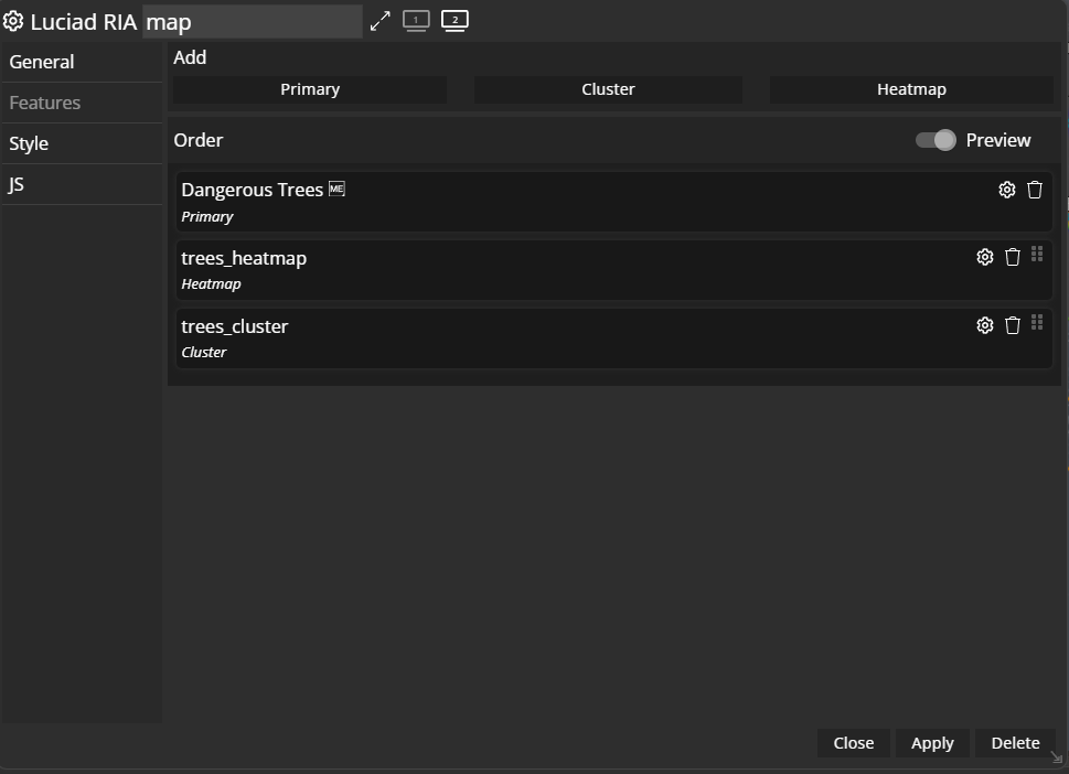
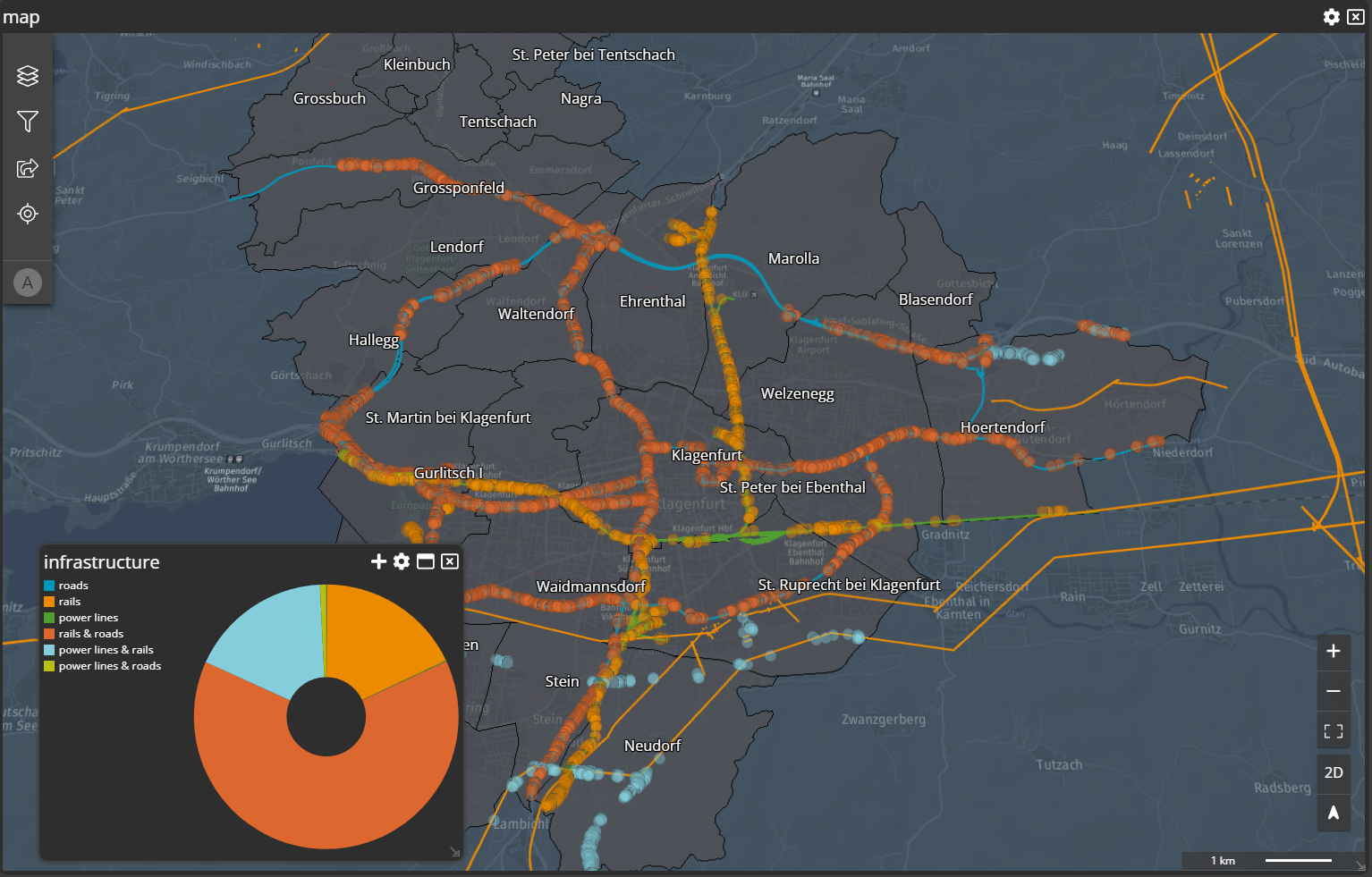
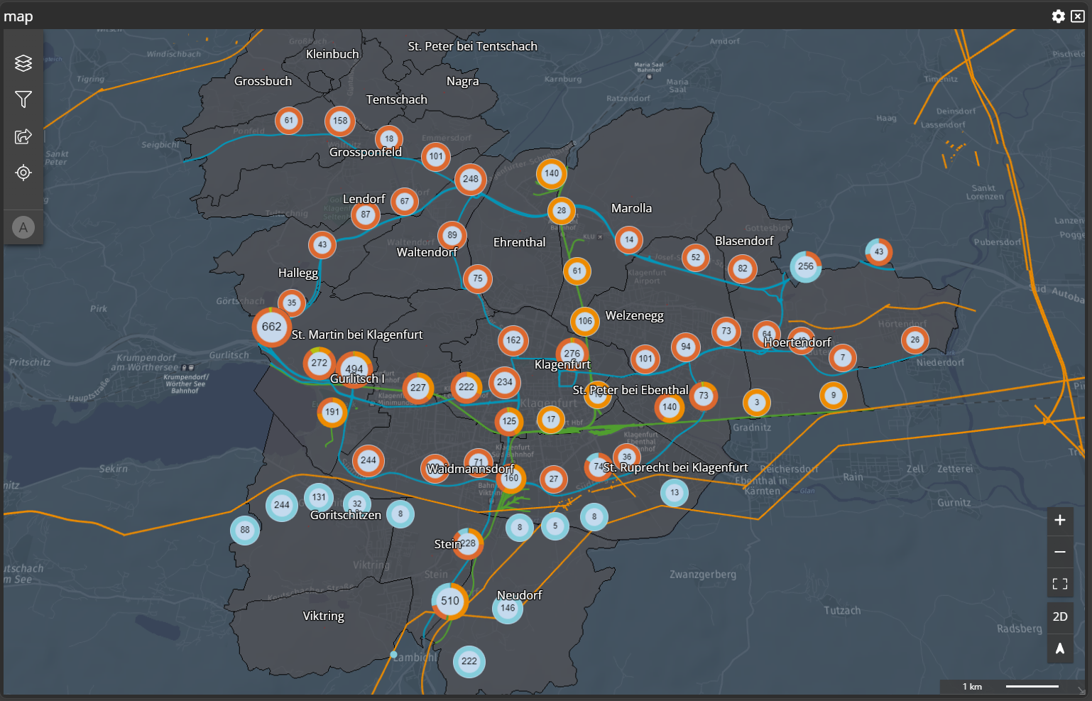
Primary
Per default this is the way to go, if you want to use the geometries / data for your widgets within Dashboard. The next screenshot shows an example of trees dangerous to public transportation / road network.
Cluster
If you want to combine these single entries to clustered elements, you have the possibility to set theFeature type to Cluster.
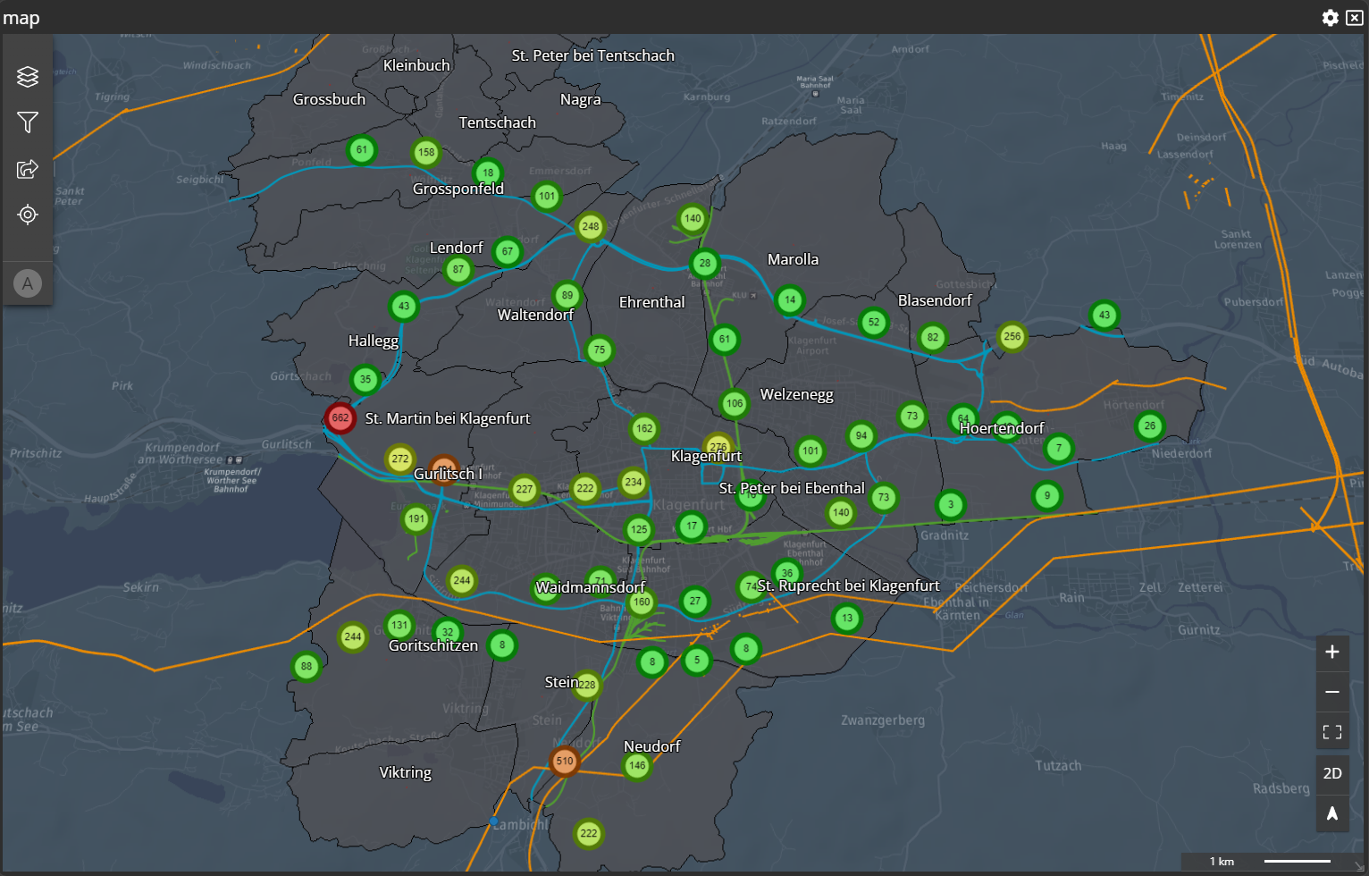
Donut around the cluster, which gives a nicer user experience and more information at first glimpse.
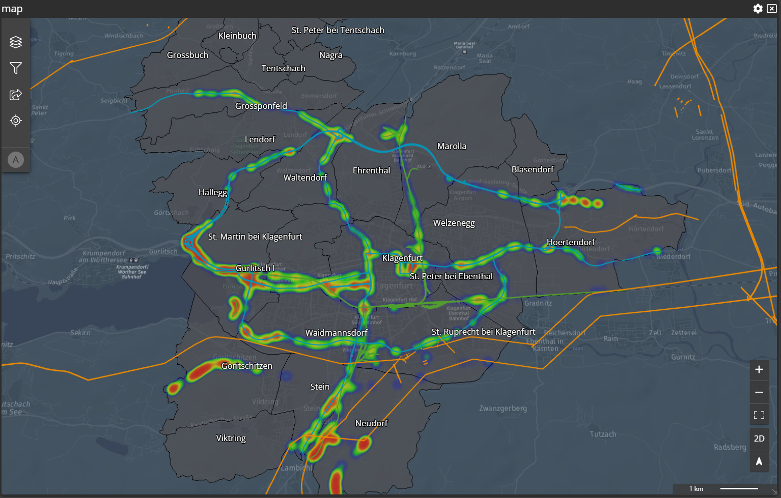
Heatmap
The last option you can choose from aFeature type perspective is called Heatmap. The following screenshot shows the above example but instead of showing the features as single elements (Primary) or as clustered elements (Cluster) the elements gets rendered as a Heatmap. The more elements within a range the more red it gets.
Preview Slider
ThePreview slider gives you the possibility to change the layer order within Dashboard to your likings. If you defined everything with M.App Enterprise you will know how your Layer Tree will look like, but it if you add Analyzer layers afterwards or adding external to your Dashboard the layer will always go to the top of the Layer Tree. Within the Features tab of the map widget with drag and drop you can move around all your Analyzer layers and with activating the Preview slider (click on it) you will see the change live in the Layer Tree.