Line
In this post we'll guide you through using the Line chart to visualize the distribution of features based on a specified attribute. Additionally, you'll learn how to apply range filters to focus on the features you need on the map.
Let's break it down into easy-to-follow steps:
Creating a Line Chart
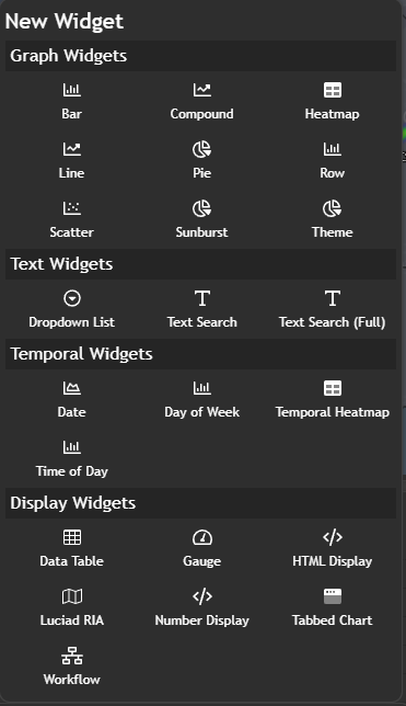
To begin, navigate to theNew Widget menu. Select Line from the list of Graph widgets.
Configuring your chart
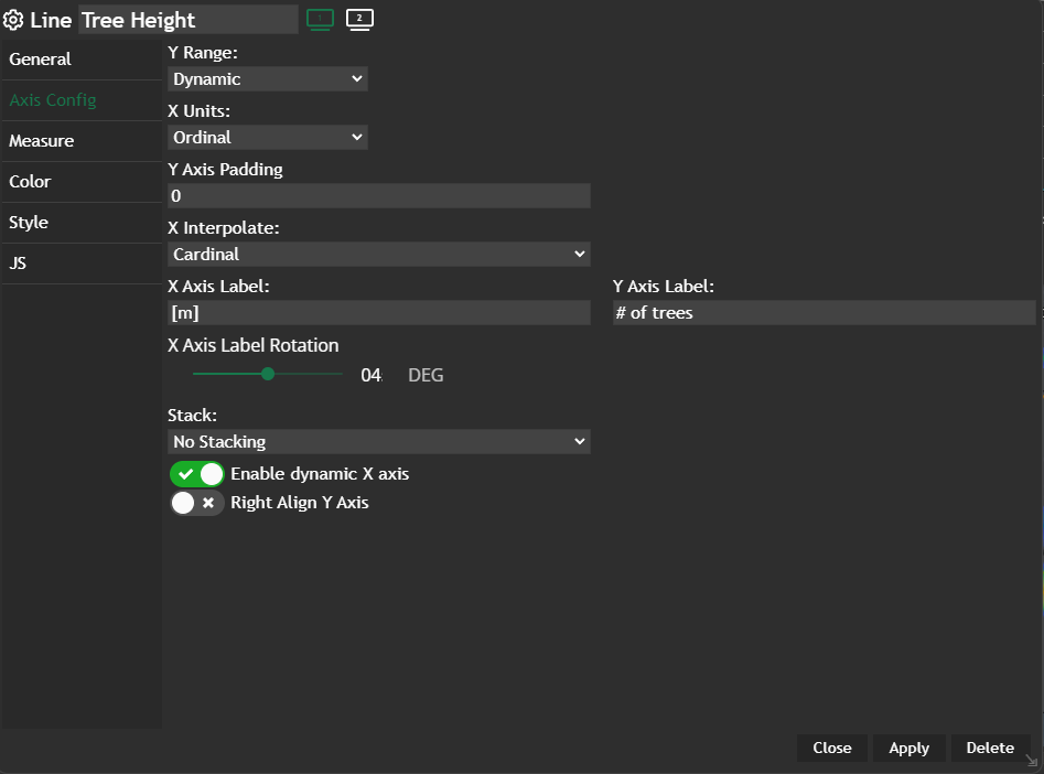
Once you're in the line configuration menu, set up your chart preferences.
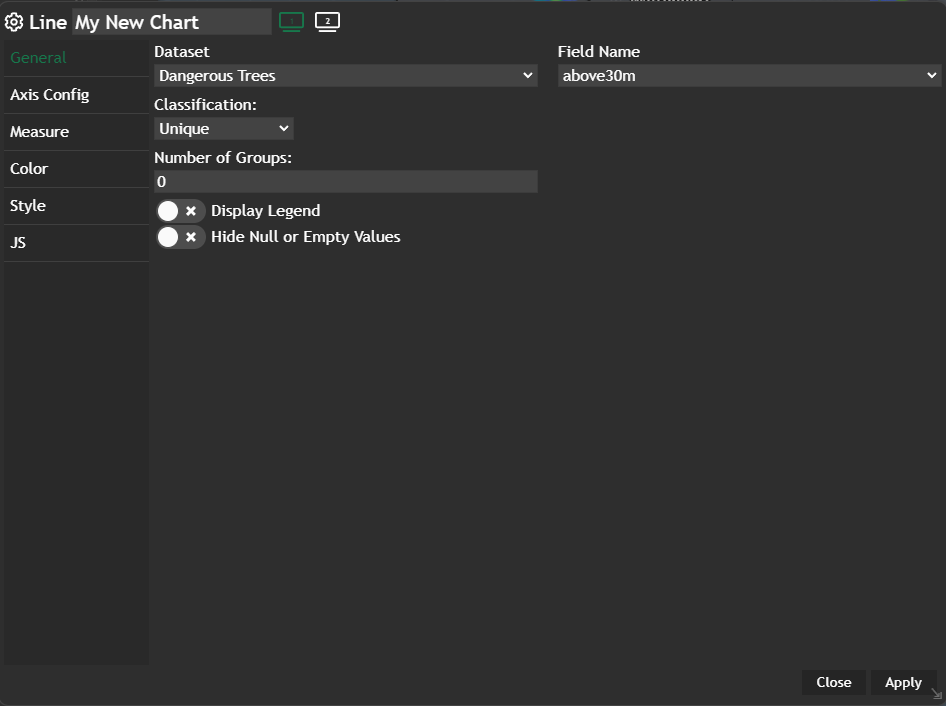
- Choose your
Datasetand the specificField nameyou want to display - Select the
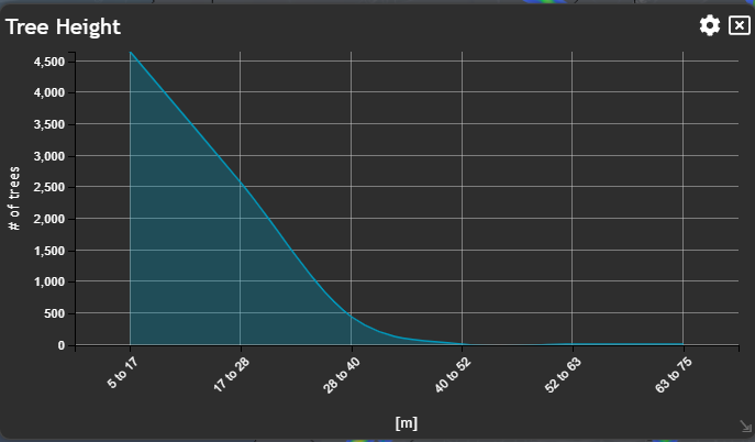
Classificationcriteria that best suits your needs - Select the number of
groupsyou wish. The number of groups basically indicates exact values (peaks and lows) of your line graph, which are connected with each other. - Decide whether you want to
Display Legendwithin the chart or not - Decide whether you want to
Hide Null or Empty Values
Apply and your configured chart will be displayed in a new widget.
💡
Hide Null or Empty values can either increase or decrease the usability of the chart. It is in the hand of the dashboard administrator / creator to decide if this slider makes sense or not.