Date
In this post, we will explore the Date chart, a powerful visual tool designed to help you analyse the distribution of features based on themes over a selected date range using an area chart.
Creating a Date Chart
To begin, navigate to the widget menu and select Date from the list of Temporal Widgets.

Configuring your chart
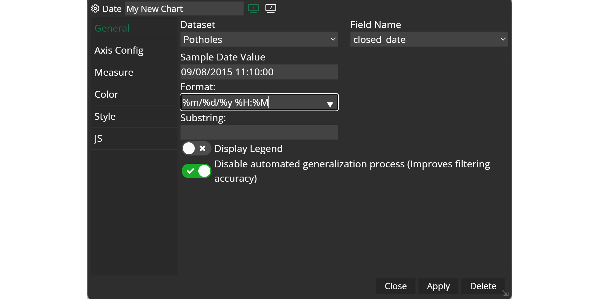
Once you're in the Date configuration menu, set up your chart preferences.
- Customize the chart name by clicking on
My New Chartat the top of the modal. - Choose your
datasetand the specificfieldyou want to display. - Select the
formatthat best suits your needs (For Example: %m%d%Y). Accordingly to your choice, a sample of your dataset will be displayed inSample Date Value. - Decide the
substringyou need. - Decide whether you want to
display a legendor not. - Decide whether you want to
disable the automated generalization processor not.
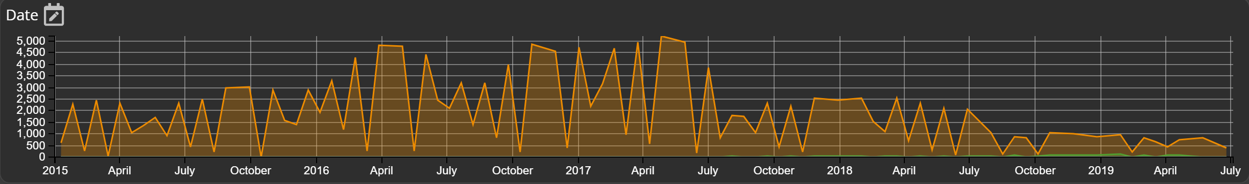
Example
By following these steps, you can use the Date chart to analyse feature distributions and trends over a selected date range, simplifying data exploration and aiding in data-driven decision-making.
Setting a date range
When your widget is created you will find a calender icon next to its name on the top left of the widget window. When you click on it, another window opens up, which allows for setting a date range. This setting acts as a filter. You will immediately see the changes in other widgets with the same dataset.

Once your date range is applied, the range is displayed in your widget too and can be changed by dragging the filter frame. The start and end dates of the selected date range filter are shown in the chart title, providing you with a clear reference for the filtered data.
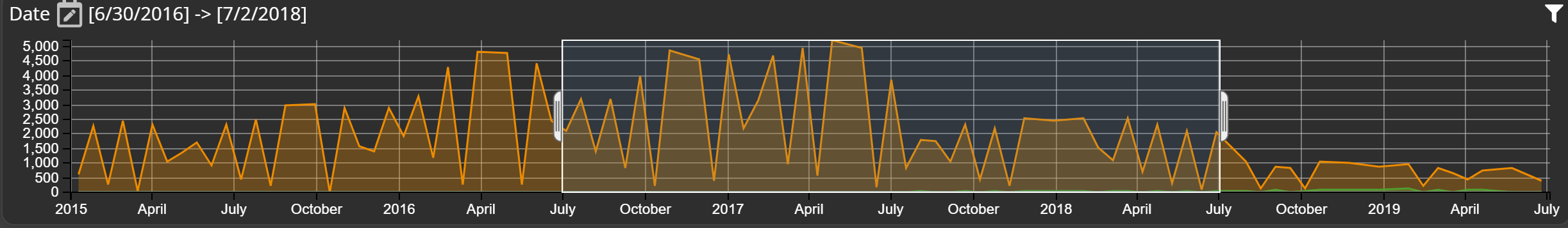
Reset the filter by clicking on the reset icon on the top right or open the widget configuration and click on apply.