Bar
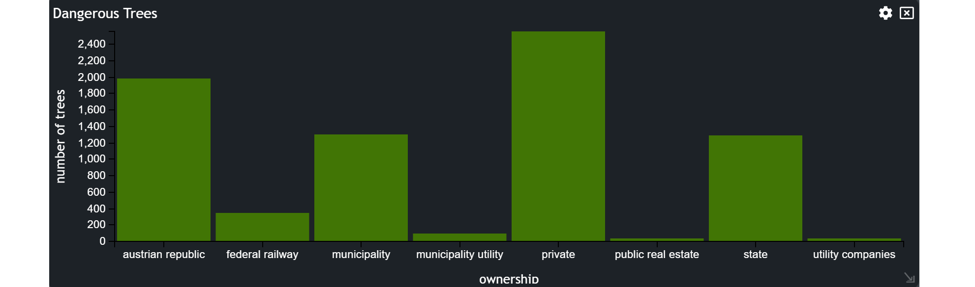
The Bar chart is a powerful visual tool that showcases the distribution of features, grouped by a specific attribute, using bars.
In this tutorial, we will guide you through the process of utilizing the Bar chart. Not only will you learn how to create it but also how to apply filters to pinpoint the features you need on the map.
Let's break it down into easy-to-follow steps.
Creating a Bar Chart
Select the Bar icon from the list of graph widgets in the widget menu.

Configuring your Chart
Once you are in the bar configuration menu, set up your chart preferences.
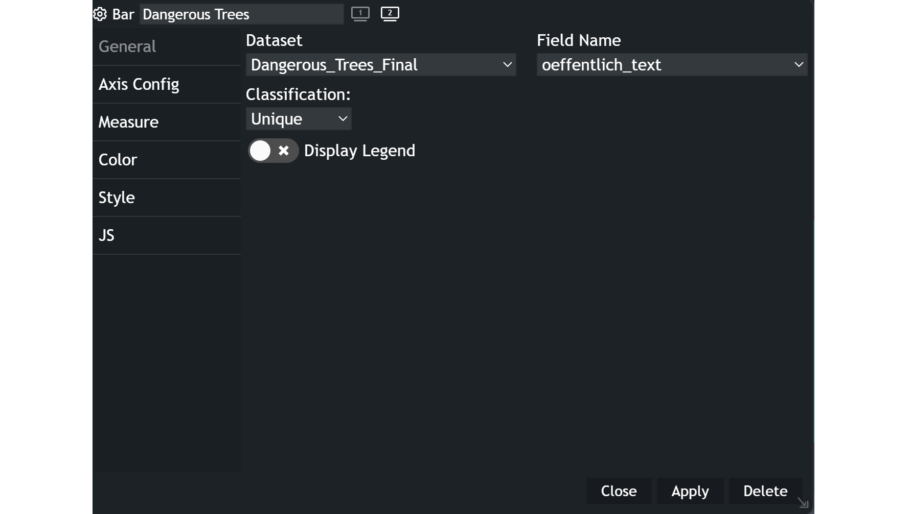
General
- Customize the chart name by clicking on
My New Chartat the top of the modal. - Choose your
datasetand the specificfieldyou want to display. - Select the
classificationcriteria that best suits your needs. - Decide whether you want to display a
legendor not.
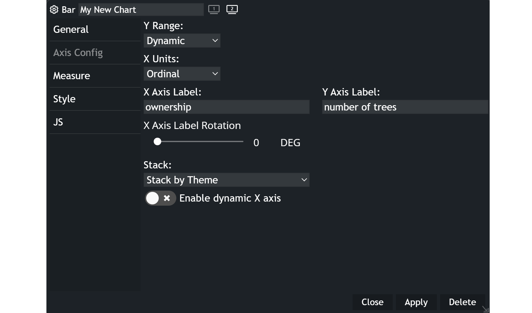
Axis Configuration
Y Range: You can either select dynamic or static, whereas the latter one will keep the same y-axis range which you can specify with a minimum and maximum. If you apply a filter, the range will stay the same. A dynamic range will adapt accordingly to the data shown in the bar chart.X Units: Default is set to ordinal, which categorizes the x-axis values. The linear setting allows for more flexibility in the x-axis range.Label: Labeling enables you to name both your axes in the chart.Label Rotation: This setting allows rotation of the text of the x-axis values.Stack: You can take another attribute into account, that shows the distribution for each bar.
Example