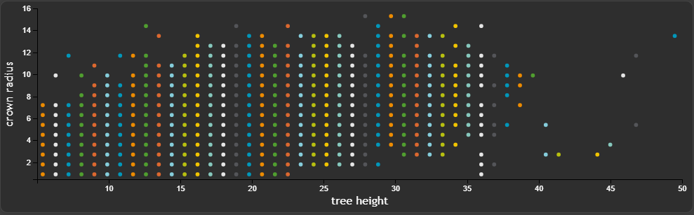
The result of this tutorial is to create the following Scatter widget
We want to show all necessary settings in order to achieve that. Every needed tab in the
Widget configuration window is highlighted with a seperate header.
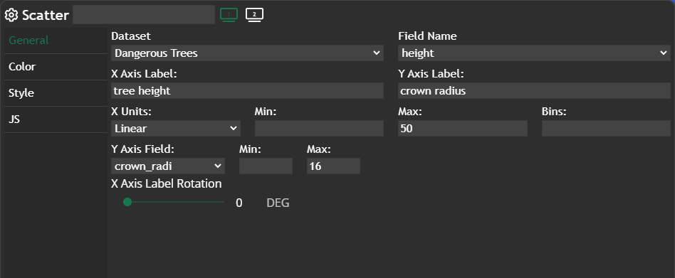
General
Basically all settings are happening inGeneral. We have to define a Field Name, which works as the x-axis. The counter part to this column is Y Axis Field, which defines what on the y-axis should be shown. Additionally we are changing X Axis Label and Y Axis Label.
In this example we want to show the distribution between tree height and the crown radius.
We also want to "limit" both axes, which means you have to define the max value for x and y IF you are not happy with the automatic limitation.
Color
Hexagon is set for the color palette, which gives us the corporate colors for our Scatter widget.
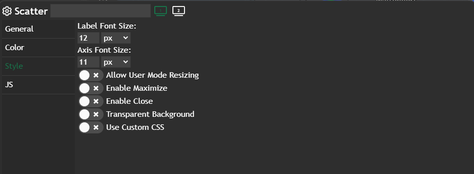
Style
We are changing theLabel Font Size to one px smaller then the default value.
Further information
If you need further information about this kind of widget, please visit the following link.
Scatter
In this tutorial, we will delve into the Scatter Chart, a robust visual tool that illustrates the distribution of features by utilizing two attributes in a scatter chart. 💡A scatterplot shows the relationship of two attributes of a dataset. Depending on the pattern of the dots, a correlation can b…
 Marina Lanxinger