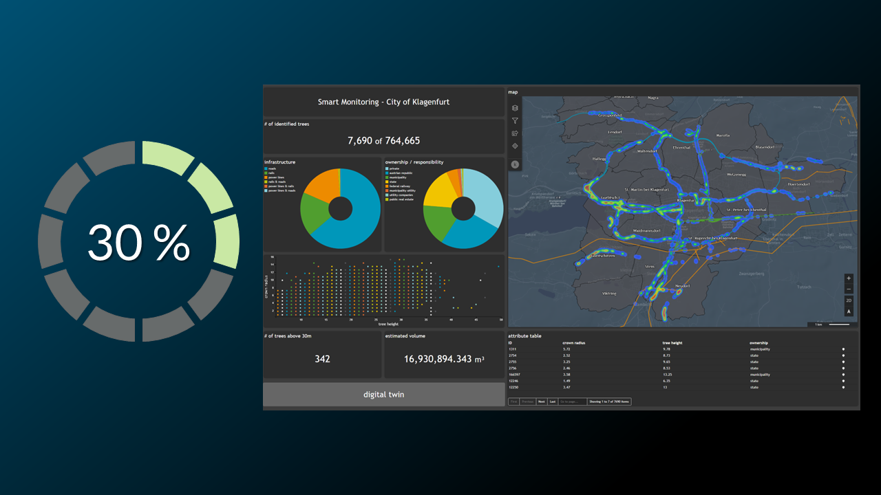
The result of this tutorial is to create the following Theme widget
We want to show all necessary settings in order to achieve that. Every needed tab in the
Widget configuration window is highlighted with a seperate header.
General
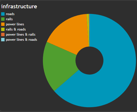
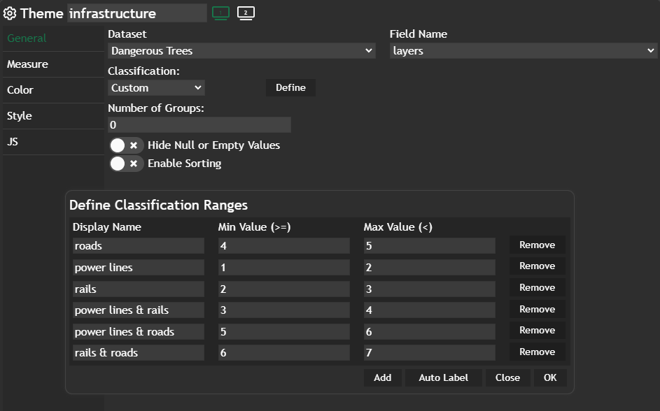
Thename of the Theme widget will be infrastructure and you have to select one column out of the entire table in order to get the widget up and running.
For this example we also set the Classification and defined a Custom one. In there you have further the possibility to change the label / display of the values from your column by clicking on Define. In this example the datatype of the column is numeric but we want to show strings instead of integer values.
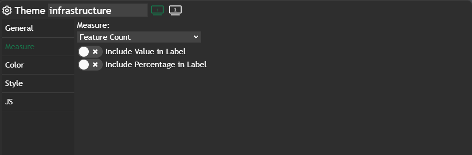
Measure
We didn't change anything here - default value isFeature Count.
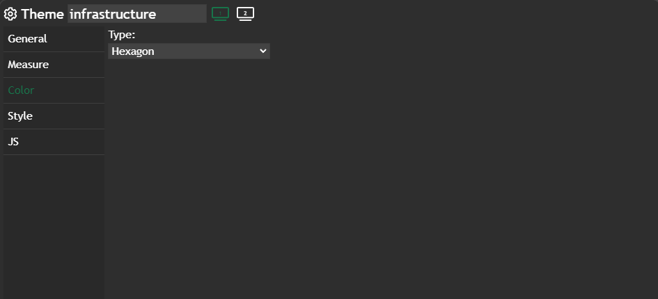
Color
Hexagon is set for the color palette, which gives us the corporate colors for our Theme widget. In this example we didn't define a StyleSet for our thematic styling but let Dashboard to do this work.
Styling between Theme chart and Luciad RIA map
This tutorial will outline the possibilities to combine a styling from your map view in Dashboard with a theme widget and vice versa. There are two ways to apply the same styling to both widgets. 1. Either you have a specific styling for your Luciad RIA content and you want
 Marina Lanxinger
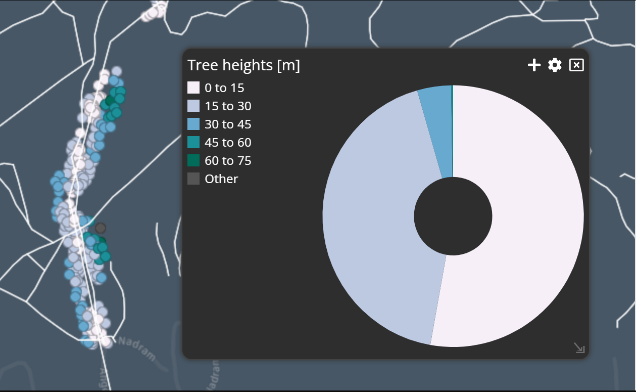
Further information
If you need further information about this kind of widget, please visit the following link.
Theme
In this post, we will explore the Theme Chart, a powerful visual tool that allows you to visualize the distribution of features based on a specified theme attribute in a pie chart format. Why using a Theme chart? The Theme chart simplifies data exploration and aids in analyzing feature distribut…
Marina Lanxinger