Create and use joined datasets in Dashboard tooltips
POSTED: | UPDATED: | by Markus Holler

This tutorial aims to demonstrate the generation of dataset joins using an example, and subsequently illustrate how to effectively utilize them.
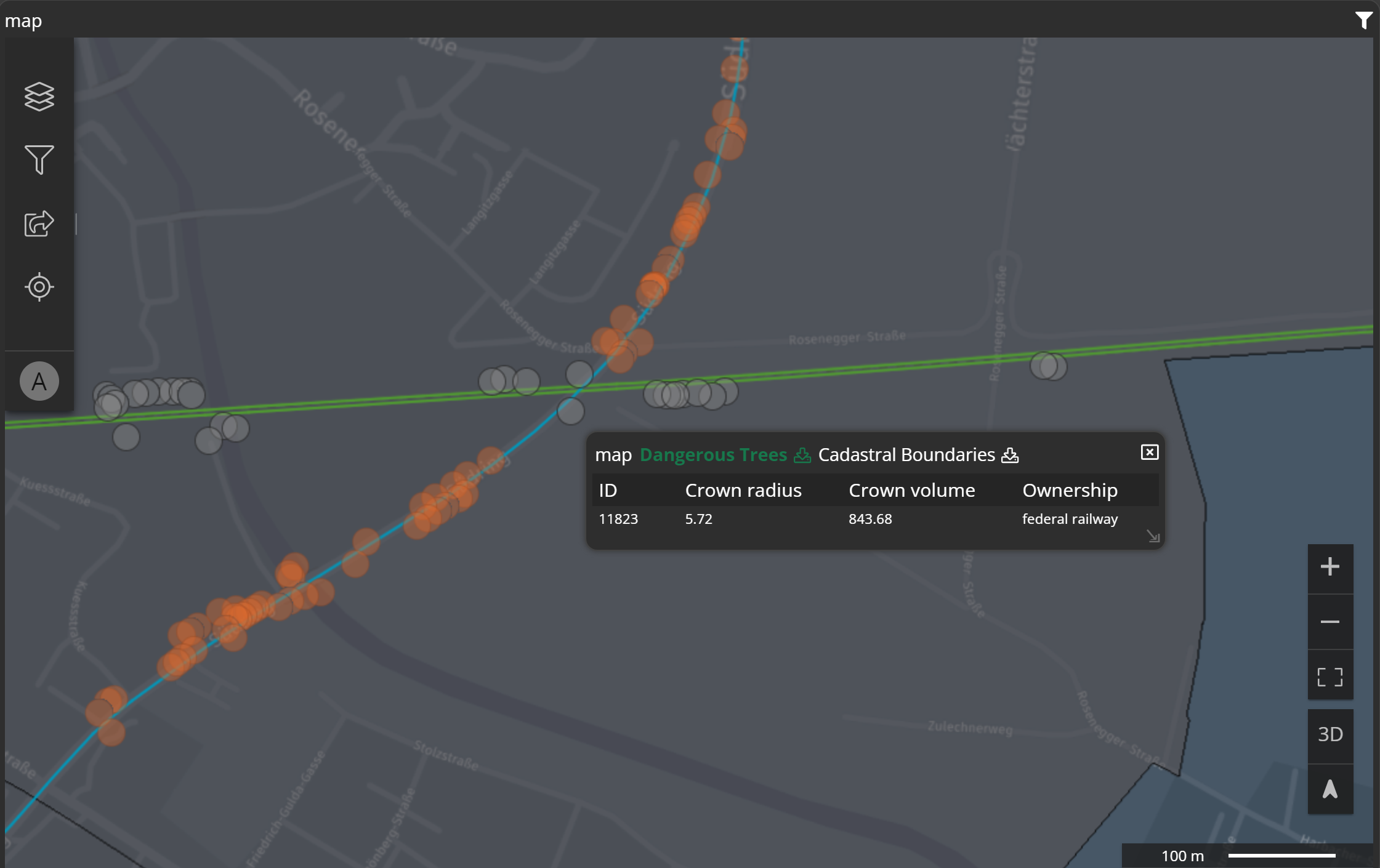
A potential application for joined datasets is their utilization in tooltips, offering expanded options for attribute values. In the example below, the ownership attribute comes from another linked dataset.
Let's break down this beautiful example into a few simple steps and rebuild it!
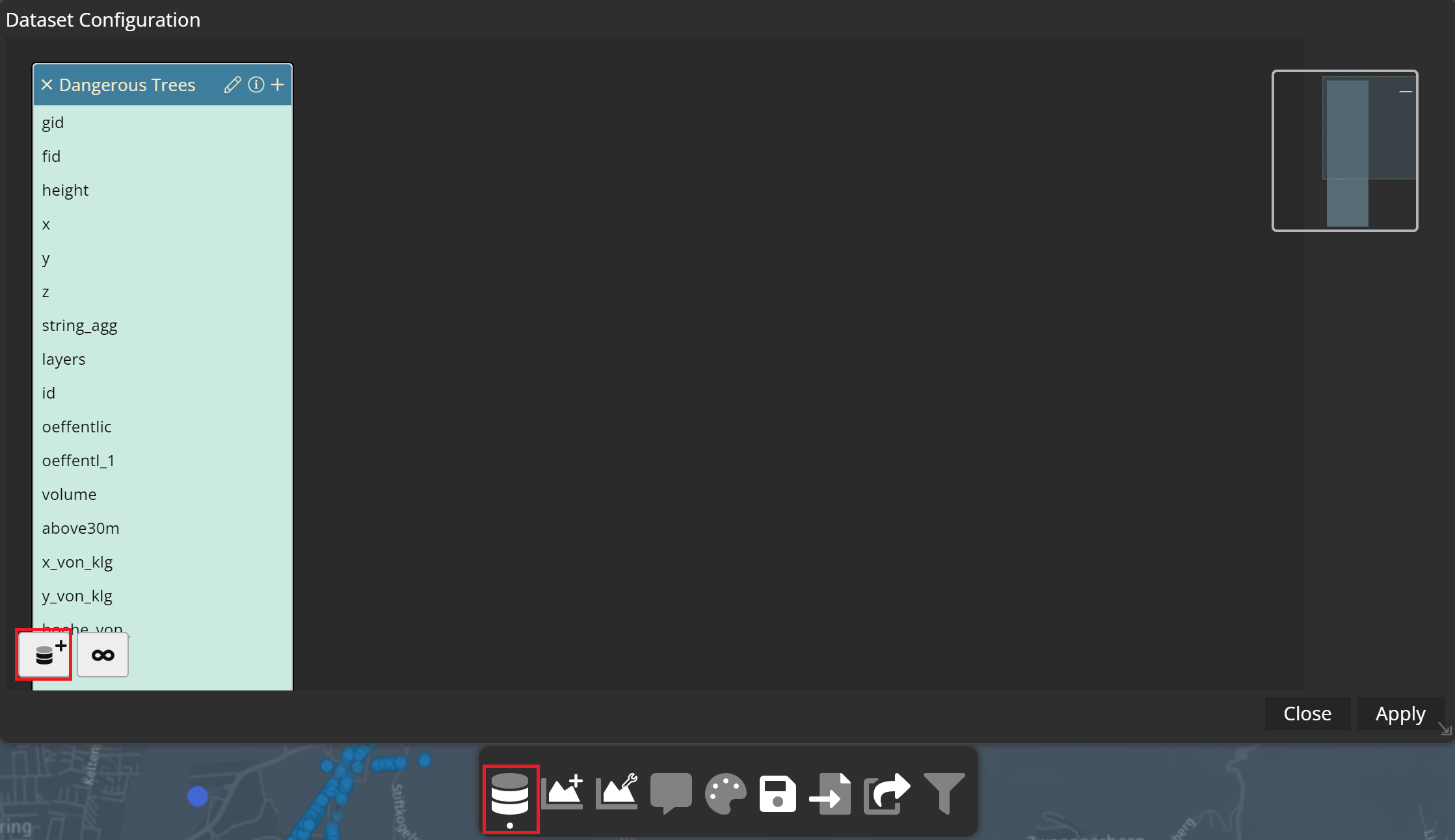
1. Add vector/attribute data in Studio
Open M.App Studio and navigate to the Conent menu. Select either vector or attribute data and click on New.
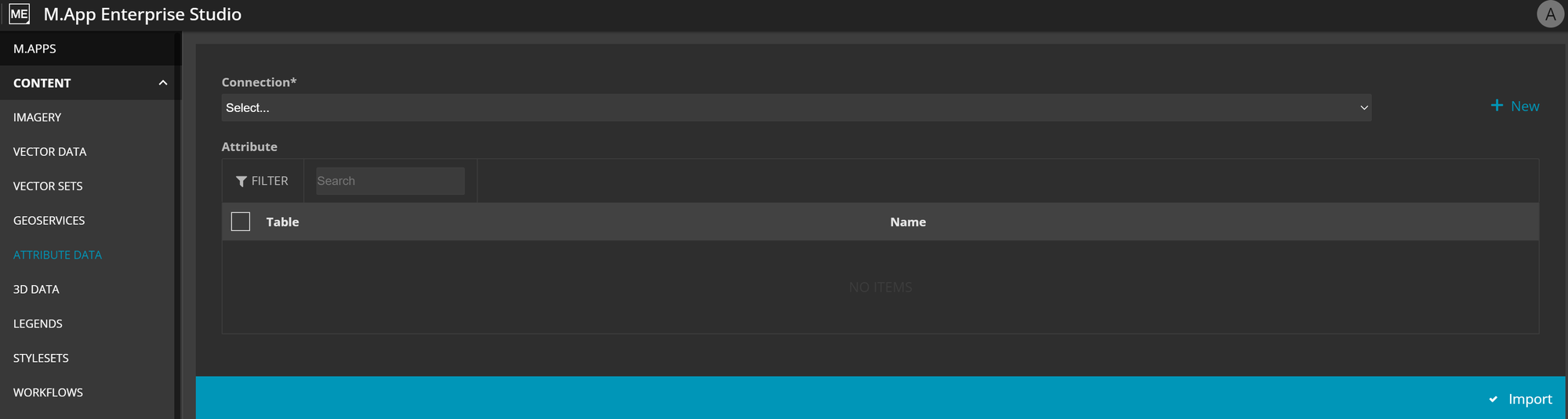
Add the according dataset, name it and click on import. You will be forwarded to the list of all vector or attribute data.
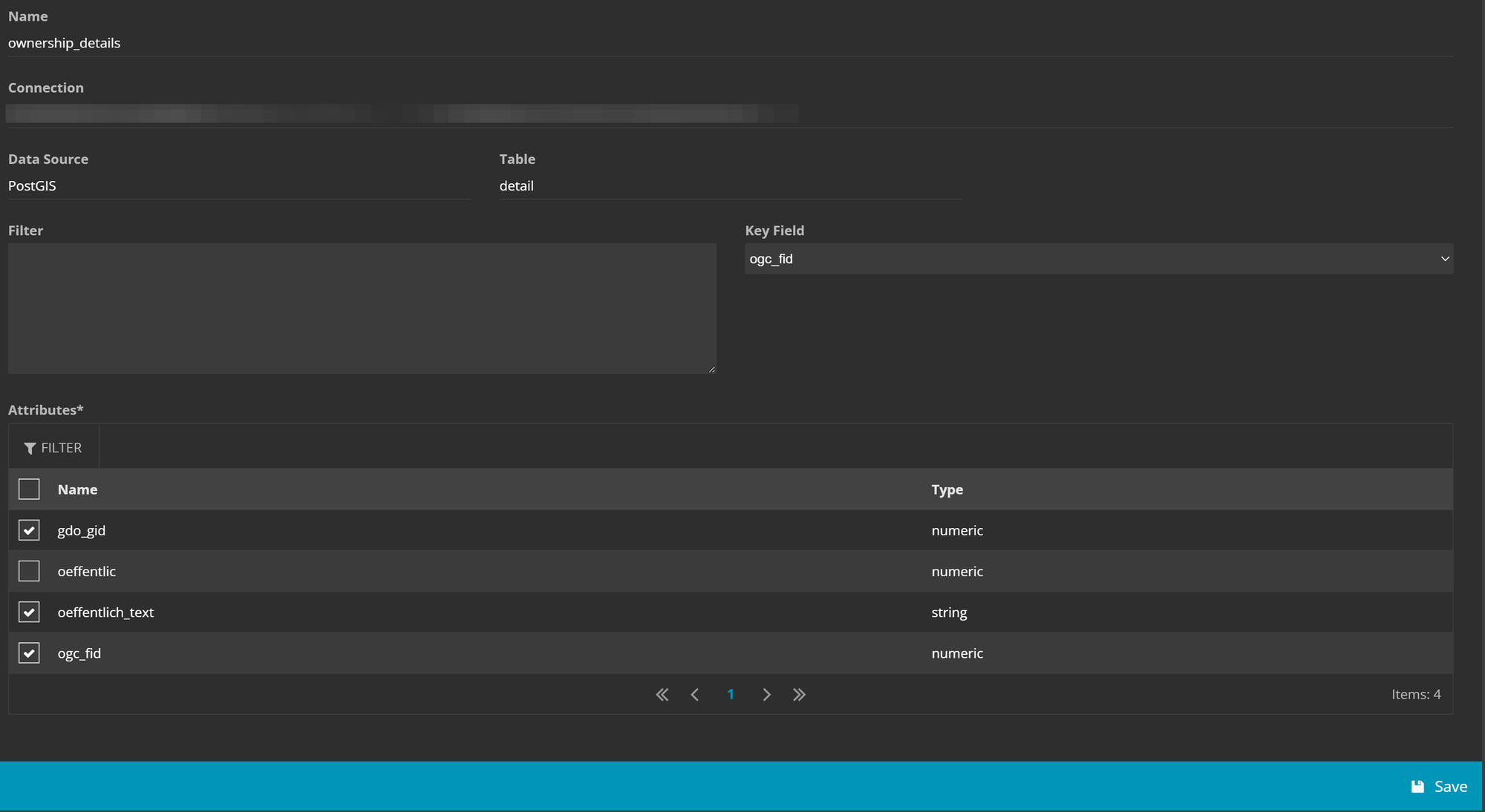
Specify attribute fields
Within the attribute data list, select the editpencil icon for the recently added dataset. This action allows you to select the attribute fields that should be incorporated. Simply deselect the fields you don't require.
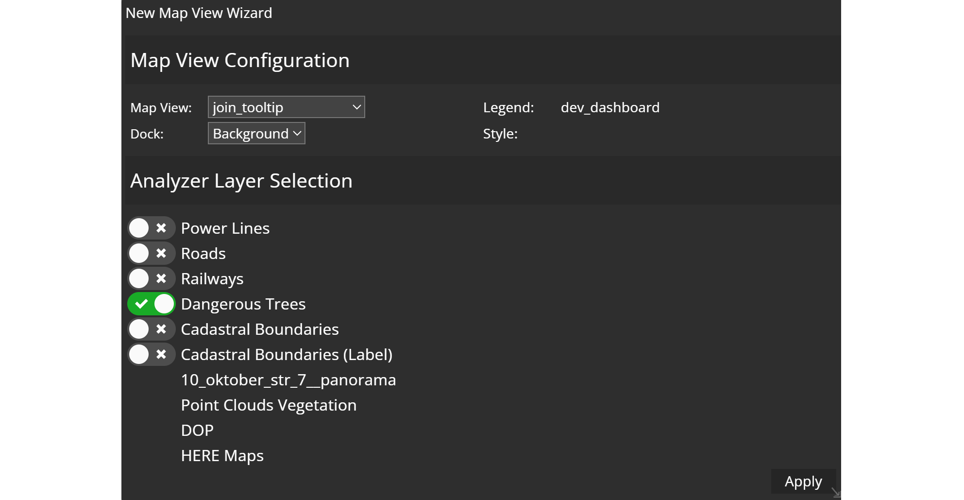
2. Create a Dashboard
Before proceeding with the creation of a dashboard, ensure to set up a legend for the associated vector layer. Additionally, include a map view to integrate into your dashboard later on.
Following that, you can proceed with creating the dashboard.
- Access the Dashboard editor.
- Choose the appropriate map view.
- Move the slider of your vector layer to make it an
analyzer layer.
3. Join your datasets
To perform dataset joining, simply access the dataset configuration from the menu bar at the bottom.
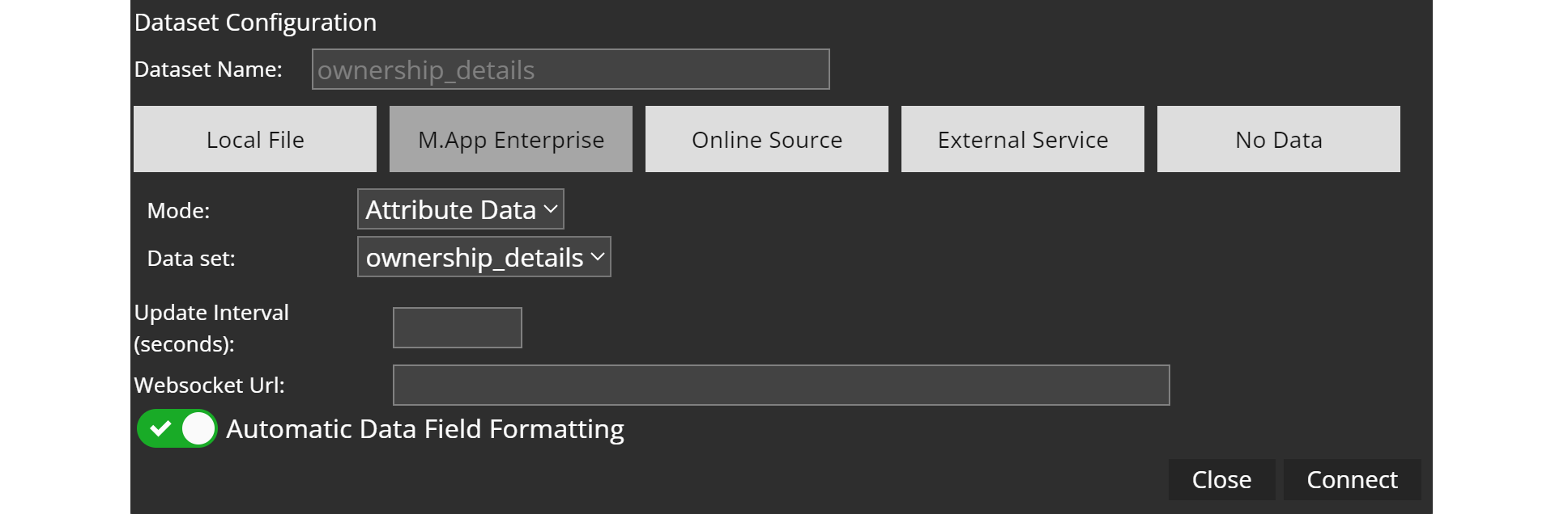
Initially, you need to import your attribute data into your dashboard. This is carried out by using the add dataset button.
Click on the M.App Enterprise button to switch the input form and activate attribute data import. Adjust the mode accordingly, select your dataset and optionally rename it, before connecting it.
Once you've imported your attribute dataset, you can proceed to join it with the corresponding vector dataset. Position the dataset tables next to each other in the configuration. Then, click on any attribute, in this case the fid field, and drag it to the common field in the other table, ogc_fid in this example.
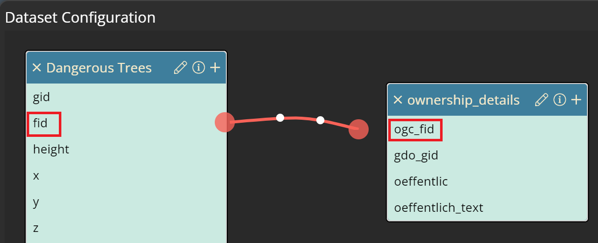
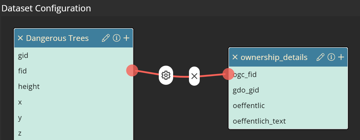
Upon completing this step, you will observe a connecting red line between the two tables.
Create a tooltip
Therefore, you need to use the tooltip button in the main menu of your dashboard.
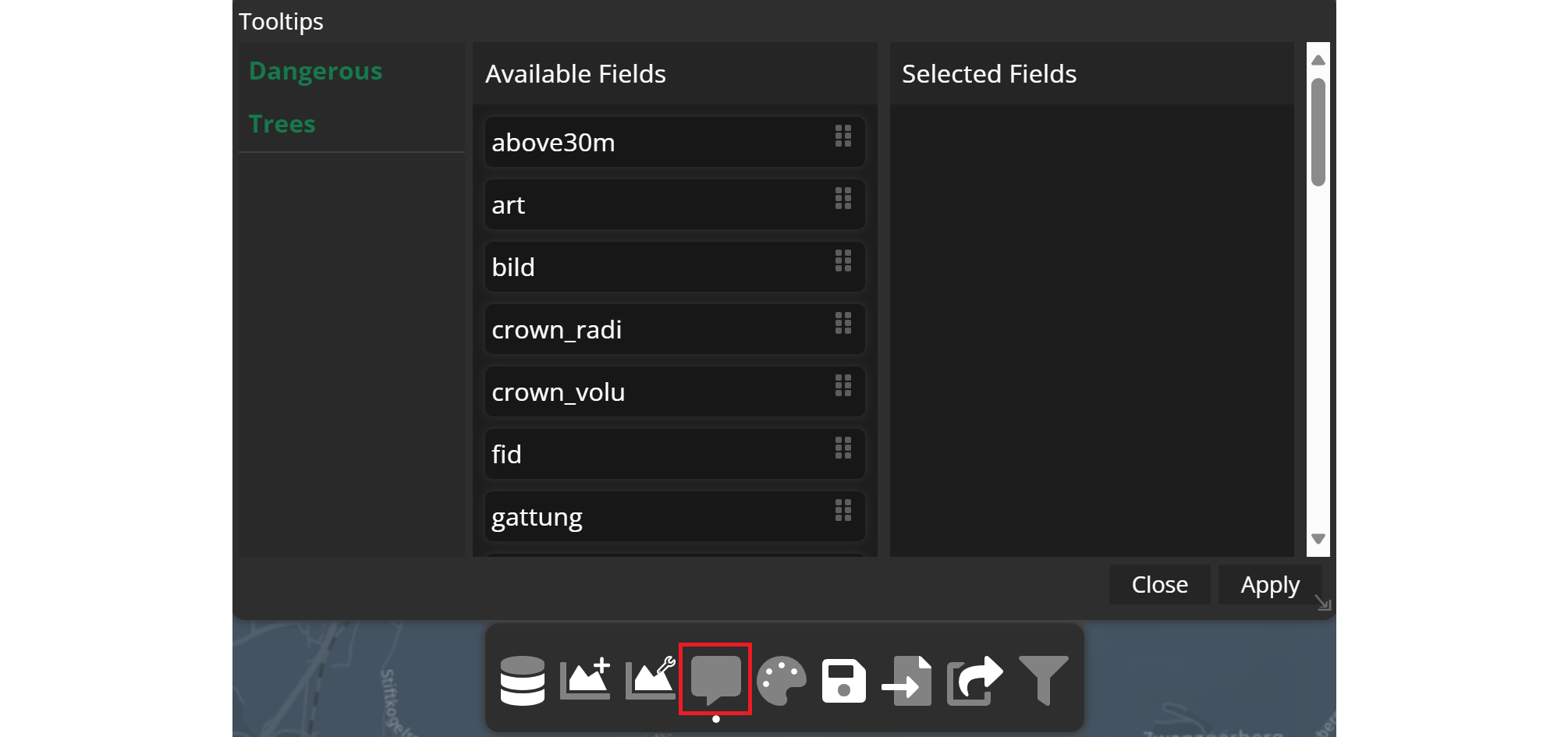
On the left you see all analyzer layers, which, in this example contains just dangerous trees. All attributes are displayed in the available fields section. As you scroll down, you will also encounter additional attributes from the join.
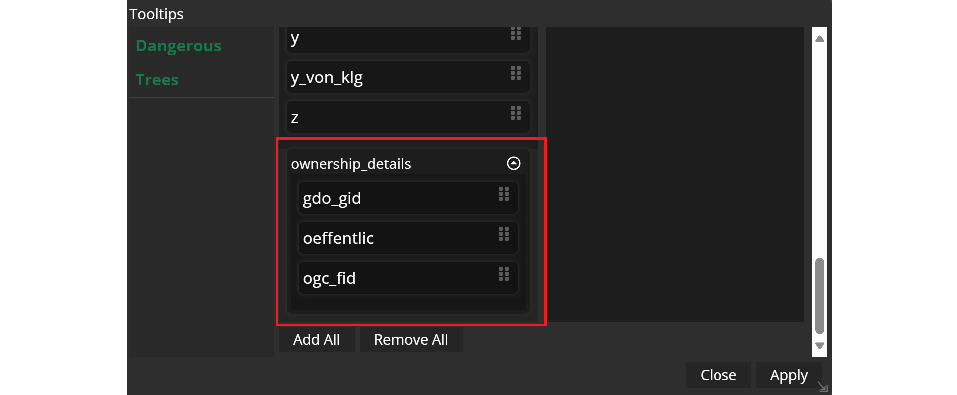
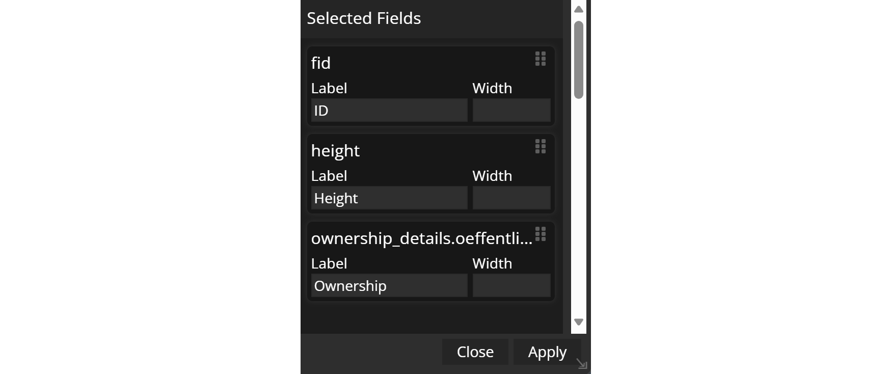
Drag and drop the desired fields into the selected fields list, provide them with suitable label names and click Apply to finalize the selection.
Your tooltip is set to be displayed within a nice application.