The result of this tutorial is to create the following Pie widget
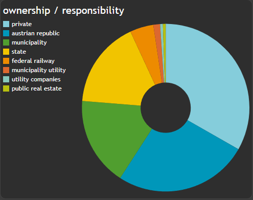
We want to show all necessary settings in order to achieve that. Every needed tab in the
Widget configuration window is highlighted with a seperate header.
General
TheField Name for this chart is based on a Functional attribute and not on the values of the table itself.
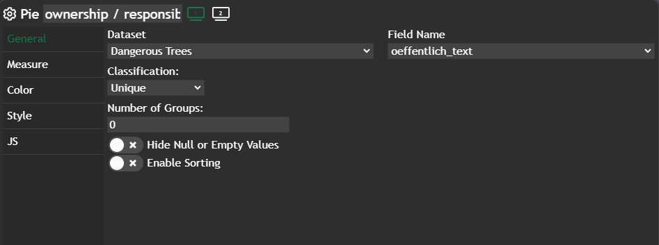
Functional Attribute
These attributes can be defined at theDataset configuration and in there you can write your own JavaScript code, based on one or more columns in your data table.
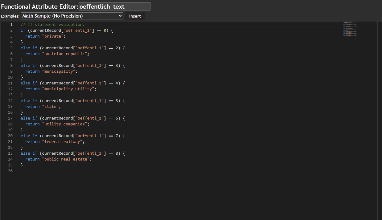
// If statement evaluation.
if (currentRecord["oeffentl_1"] == 0) {
  return "private";
}
else if (currentRecord["oeffentl_1"] == 2) {
  return "austrian republic";
}
else if (currentRecord["oeffentl_1"] == 3) {
  return "municipality";
}
else if (currentRecord["oeffentl_1"] == 4) {
  return "municipality utility";
}
else if (currentRecord["oeffentl_1"] == 5) {
  return "state";
}
else if (currentRecord["oeffentl_1"] == 6) {
  return "utility companies";
}
else if (currentRecord["oeffentl_1"] == 7) {
  return "federal railway";
}
else if (currentRecord["oeffentl_1"] == 8) {
  return "public real estate";
}
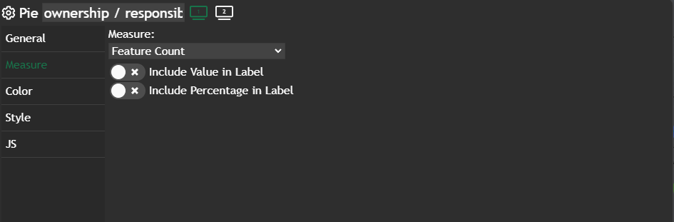
Measure
We didn't change anything here - default value isFeature Count.
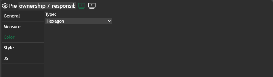
Color
Hexagon is set for the color palette, which gives us the corporate colors for our Pie widget.
Further information
If you need further information about this kind of widget, please visit the following link.
Pie
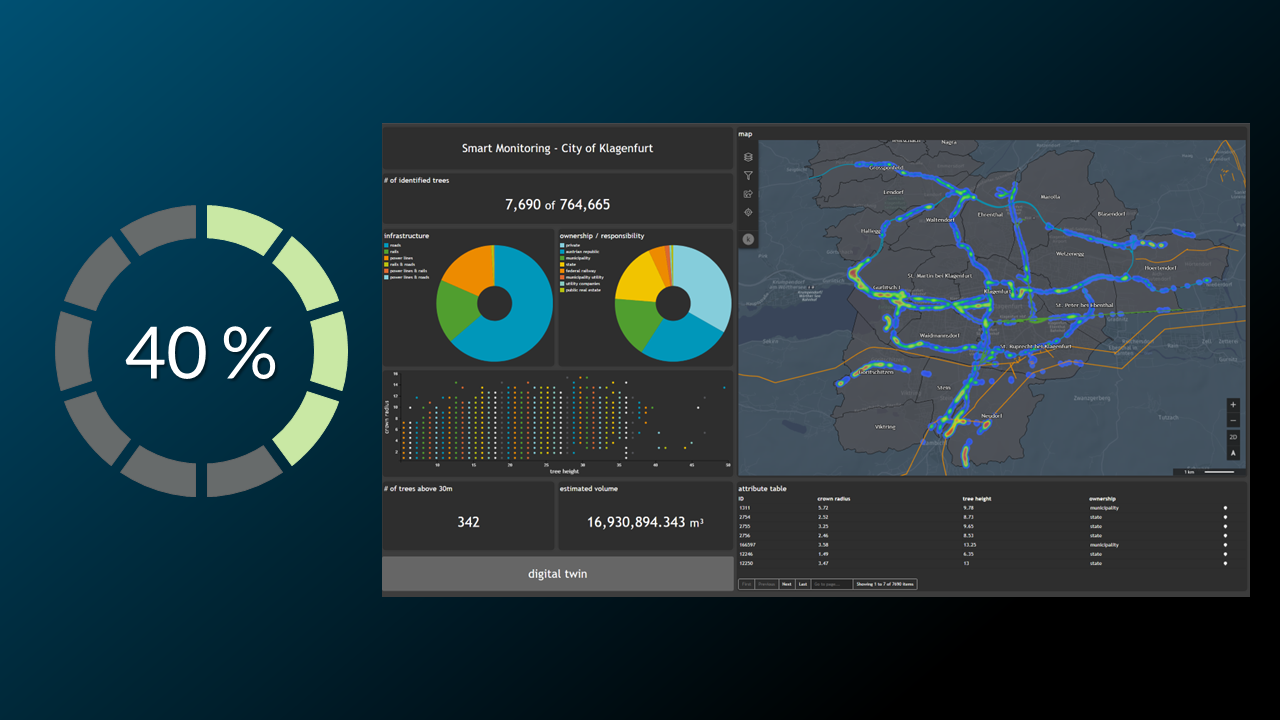
In this post, we’ll guide you through using the Pie chart. You’ll also learn how to apply filters to focus on the features you need on the map. The Pie chart is a visual representation that displays the distribution of features, grouped by a specific attribute, using slices in a
 Marina Lanxinger