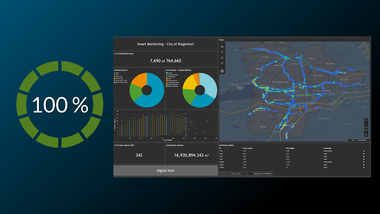
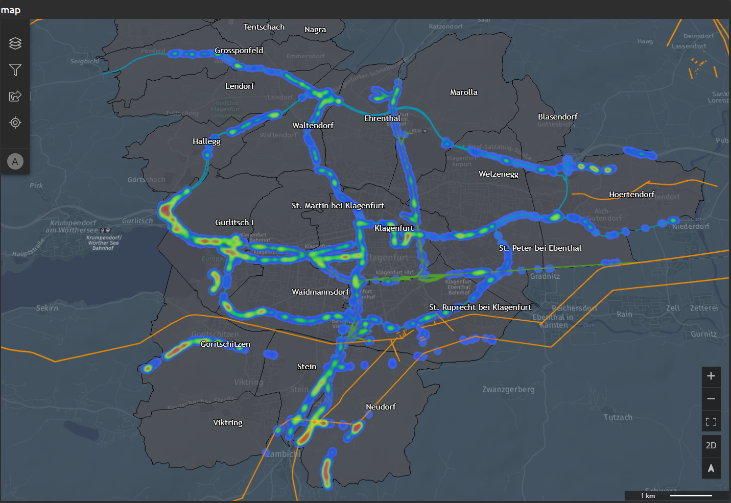
The result of this tutorial is to create the following map widget
💡
All vector data comes in via a StyleSet defined in M.App Enterprise Style Editor. This post talks about changing styling for Analyzer layer, which are defined at the start wizard of M.App Enterprise Dashboard.
We want to show all necessary settings in order to achieve that. Every needed tab in the Widget configuration window is highlighted with a seperate header.
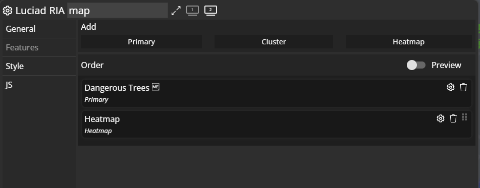
Features
In this tab you'll see the Primary features, which is the default definition of Analyzer layers set at the beginning of your Dashboard journey. But here you have to chance to add a Heatmap layer as well, which gives an additional improvement of understanding and knowledge in the Dashboard application. By clicking on Heatmap you will come to the settings described further down the post.
💡
With clicking on the ⚙️icon you get detailed configuration possibilities.
💡
The ME icon means it is a M.App Enterprise layer - coming from a legend / MapView from inside the platform.
Primary
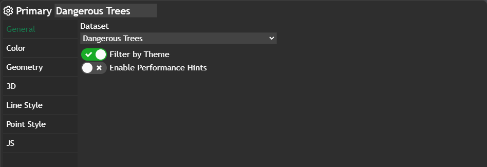
General
In this tab we use the slider Filter by theme, which means the theme chart gets filtered on a click onto the geometry instead of showing the tooltip.
Color
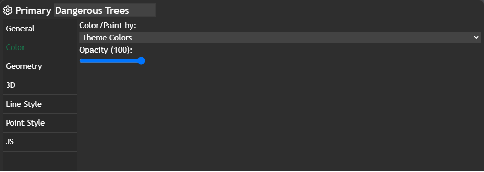
Just checking if the Color/Paint by: is set to Theme colors with no opacity at all.
Point Style
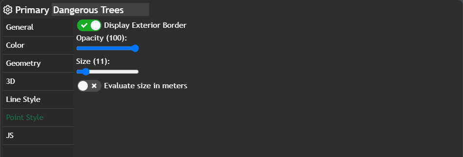
In this tab setting the Size to a specific value and also set the Opacity to 100
Heatmap
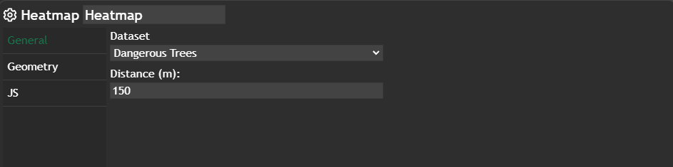
Just checking if the Distance (m) is set to 150.
Further information
If you need further information about this kind of widget, please visit the following link.