Alternative Themes and different styling in the map
This tutorial will outline the possibilities to add different themes to your Dashboard configuration
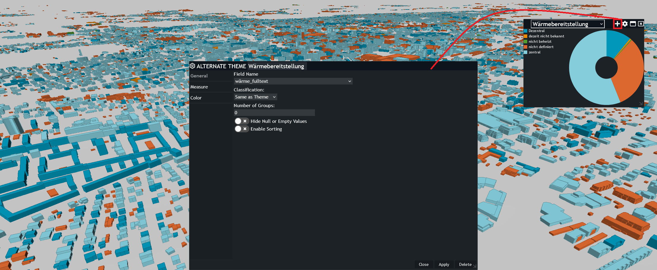
When working with Dashboards users may wish to create an alternate theme to have another attribute analysis. When switching between the main theme and the alternate theme, the user will expect to have the map features styled based on the currently selected theme. This article will outline how to create the alternate them and have the map features styled based on the currently active theme.
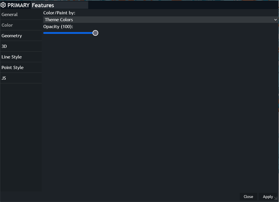
Primary feature must be set to Color/Paint by' : 'Theme Colors'
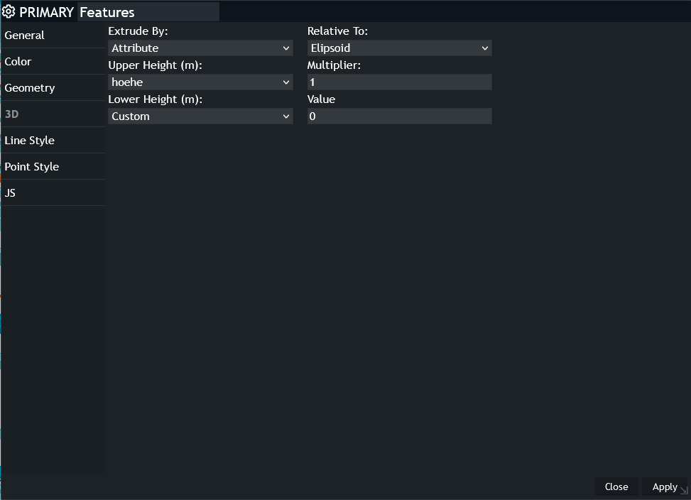
For this vector data the height information is available as well and therefore we are extruding the geometries.
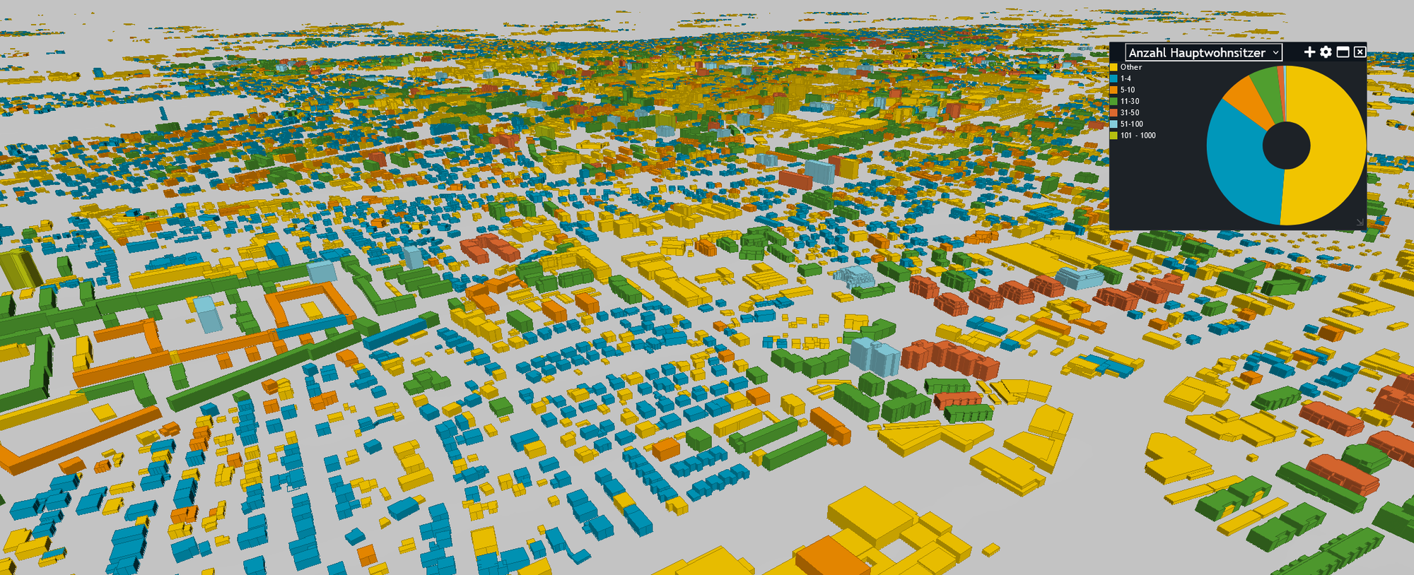
In the end the visualization could look like this if the classes are defined and the color palette is set to Hexagon
Creating an Alternative Theme
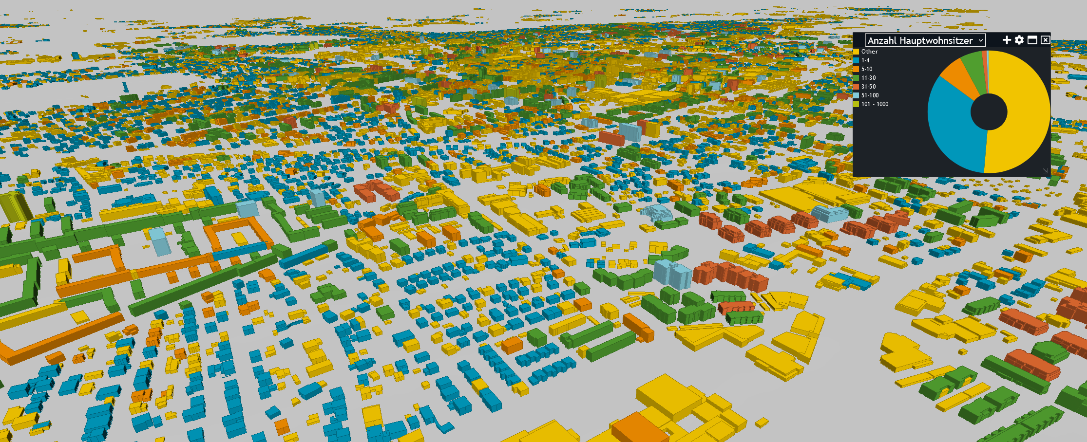
In this step we are using another attribute = column from the primary features. In this case we are using the number of people living in the house.
To do this you have to click the + to get to define an Alternative Theme.
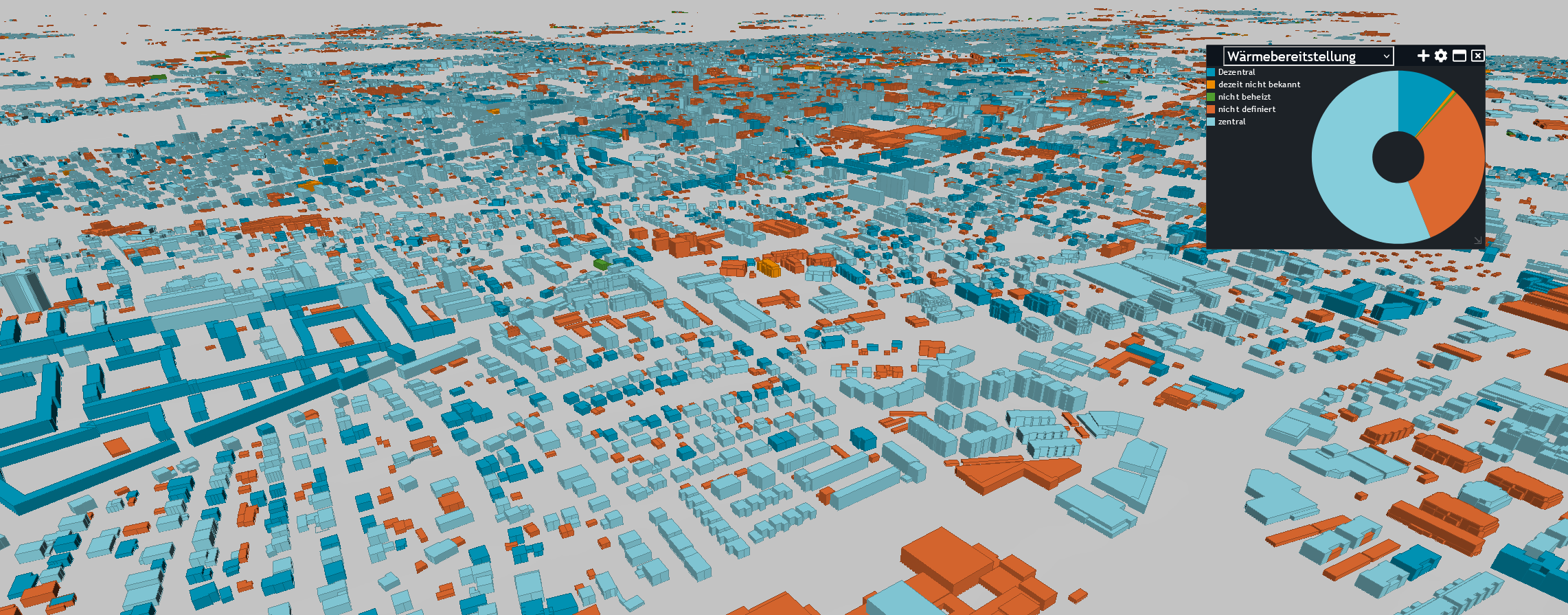
If you have changed the attribute and additionally set the correct classes - the result could look like this:
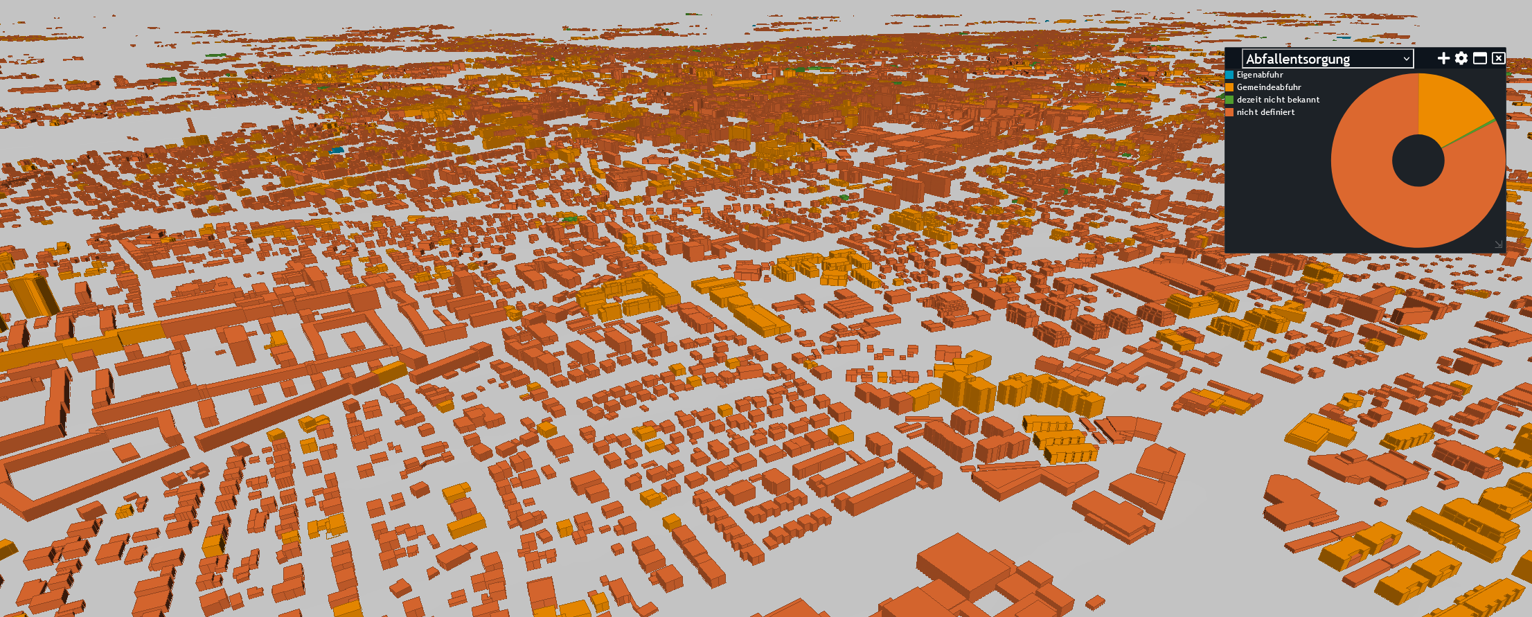
After you have defined at least one additional Alternative Theme you get a drop down, where you can decide which coloroized visualization you want to have for your features.
There are no limits on the number of Alternative Themes.